Your docs look great on every device. Phones, tablets, desktops — it just works.
Responsive by default#
I didn't want you to think about responsive design. So I handled it.
Every docs site automatically adapts:
- Desktop — Full sidebar, table of contents, spacious layout
- Tablet — Adjusted spacing, collapsible sidebar
- Mobile — Hamburger menu, stacked layout, touch targets
You don't configure anything. It just works.
Mobile navigation#
On smaller screens, the sidebar becomes a slide-out drawer. Tap the menu icon to open it, tap a page to navigate, tap outside to close.
Touch-friendly#
All interactive elements are sized for fingers, not just mouse cursors:
- Buttons and links have adequate tap targets
- Code blocks have easy-to-hit copy buttons
- Search results are easy to tap
- Navigation items have enough spacing
Why this matters#
A surprising amount of documentation traffic comes from mobile. Developers look stuff up on their phones. They share links in Slack that get opened on tablets.
If your docs don't work on mobile, you're losing people.
Performance#
Mobile often means slower connections. Dokly docs are fast ⚡:
- Minimal JavaScript
- Optimized images
- No layout shift as things load
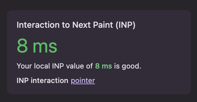
Average performance numbers:


Your users on spotty connections will thank you.