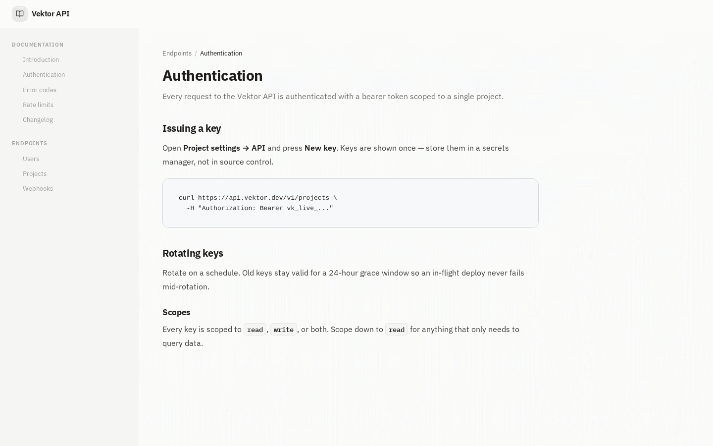
Every documentation platform's landing page makes the same promise, in roughly the same words: beautiful docs, no engineering required. You cannot tell any of us apart from that sentence. Neither can a screenshot, because a screenshot is a claim about a product rather than the product.
So we replaced the claim with the thing. The Dokly landing page now embeds the real editor and the real renderer, side by side, directly under the hero. No account, no email, no trial. You scroll down and start typing.
What "real" means here#
This is the load-bearing part, and it's the part most interactive demos quietly cheat on. Both halves of that frame are the production code paths.
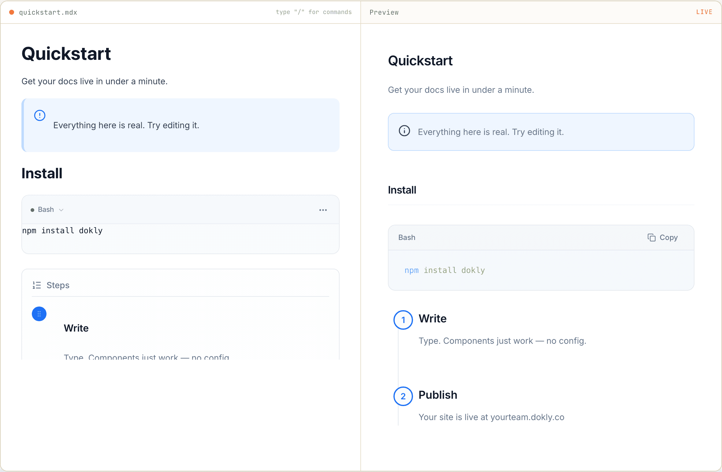
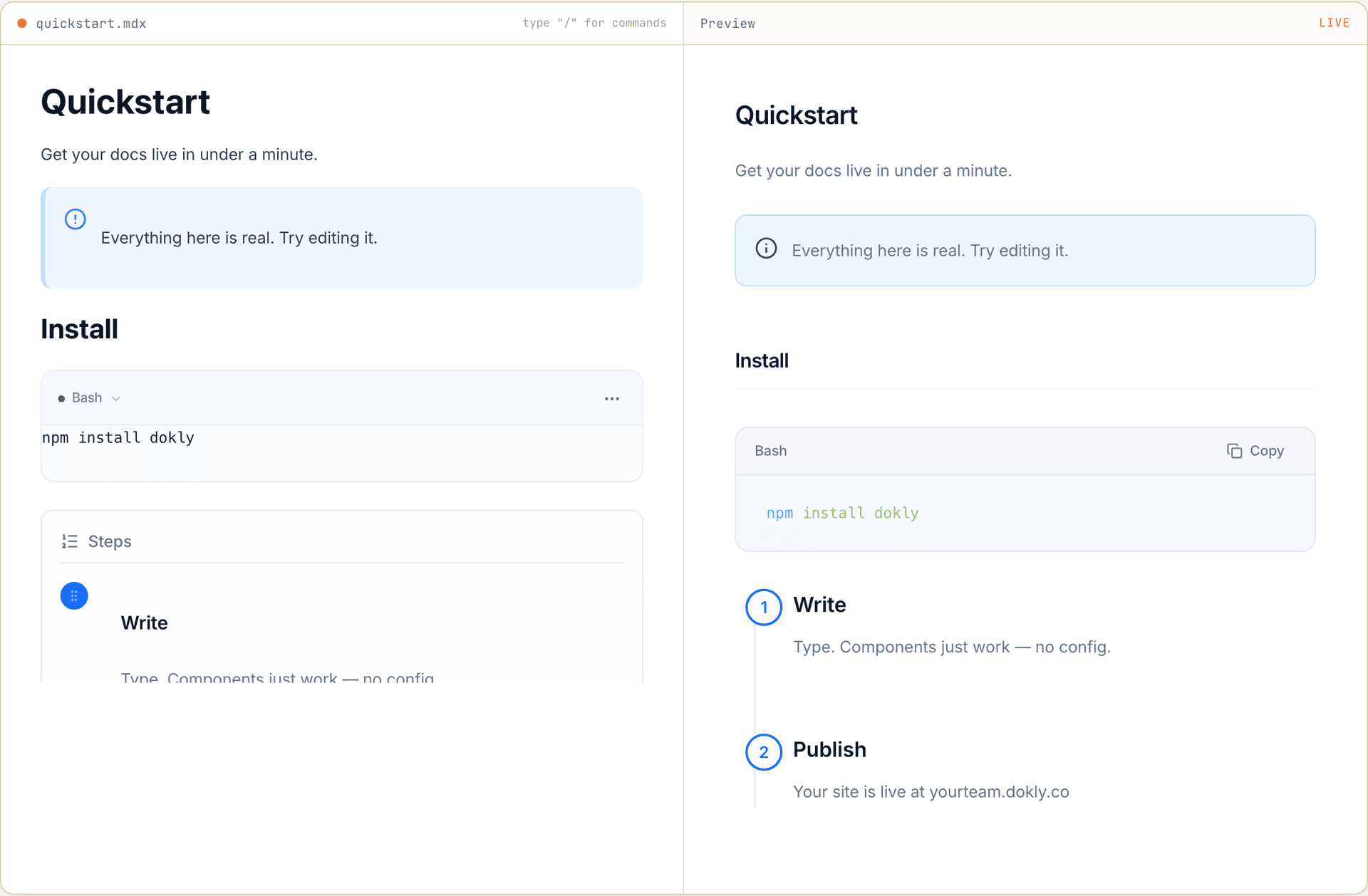
The left pane is the same editor a paying customer opens in their dashboard. Not a textarea with syntax highlighting bolted on, not a simplified marketing build — the same component, with the same slash menu and the same formatting bubble. It emits MDX on every keystroke.
The right pane compiles that MDX against the same component registry published Dokly sites render through. When you type a callout on our landing page, it goes through the code that would render that callout on yourteam.dokly.co.
That equivalence is the whole point. A demo that runs a special marketing version of the product is a screenshot with extra steps: it can't surprise you, and it can't disappoint you either, which means it tells you nothing. If our editor mangles a nested list, the landing page will mangle it in front of a prospect. We think that trade is correct. A demo you can't break isn't a demo.
Type / and the real command menu opens#
The sample document is a short quickstart — a callout, a code block, a two-item steps component. Enough to show the product has opinions about what docs look like, short enough to take in at a glance.
The interesting part is what happens when you type /.
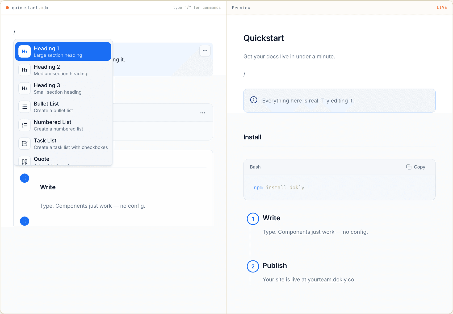
Twenty-three commands, the same ones the dashboard offers: three heading levels, bullet/numbered/task lists, quote, code block, table, divider, five callout variants, steps, tabs, card, card group, API playground, FAQ, badge, and image upload.
Look closely at the right pane in that screenshot and you'll see a stray / rendered into the preview. That's not a bug I forgot to crop out — it's the honest behavior. The preview recompiles on every keystroke, so it shows a half-typed document as a half-typed document. I left it in because a cropped screenshot of a demo would be a strange thing to publish in a post about not faking demos.
What it deliberately does not do#
Interactive demos usually get written up as if they have no edges. This one has four, and you'll hit them in about a minute, so it's better that you hear them here.
The AI features are hidden. Dokly's editor has AI generation in the slash menu and in the selection toolbar. In the landing demo, both are suppressed. This isn't a capability we lack — it's an unauthenticated page, and a public text box wired to a paid generation endpoint is a bill waiting to happen. The demo shows you the editor; the AI is behind the signup.
Nothing you type is saved. There's no document, no account, no autosave. Refresh the page and you get the sample quickstart back. It's a sandbox, and it's meant to be thrown away.
Image upload is in the menu but won't complete. The /image command opens a file picker, because it's the real menu with the real commands. Uploads need a project to belong to, so on the landing page there's nowhere for the file to go.
The two panes aren't pixel-identical, on purpose. In the first screenshot, the code block and the steps look different on the left than on the right. The editor shows editing affordances — drag handles, a language dropdown, a block menu — while the preview shows the published result. The editor is a place to work; the preview is what your readers get. Same content, same components, different jobs.
Why this exists#
Dokly is small and largely unknown, competing against products with a decade of brand behind them. On a features table we lose to at least four companies. On a landing page full of adjectives we lose to all of them, because adjectives scale with marketing budget.
What doesn't scale with marketing budget is letting someone use the product before they trust the company. The pitch we're making is that writing docs in Dokly feels good — and that is either true when your fingers are on the keyboard or it isn't. Ten seconds of typing settles a question that ten paragraphs of copy cannot.
There's a version of this decision that's just confidence signalling. This isn't that. It's the cheapest honest test we can offer, and if it convinces nobody, that's information we need more than we need the impression.
Try it#
It's at the top of dokly.co, under the hero. Type in it, break it, close the tab. If something behaves badly, that's worth knowing — reply to this post's newsletter or use the contact page and it reaches me directly.
Next on the editor is closing the gap between what you can build in Dokly and what the more established platforms let you build — more components, and better ways for the tools your team already uses to reach your docs. The demo will keep pace with the product, since it's running the same code either way.
Changelog entries#
Live editor on the landing page · Added · The homepage now embeds the real documentation editor and live preview side by side — no signup required to try it. Slash command menu in the public demo · Added · All 23 editor commands, from headings to callouts to the API playground, work in the landing page demo. AI actions hidden in the public demo · Changed · AI generation is suppressed in the slash menu and selection toolbar on public, logged-out surfaces.