Every Dokly theme used to be the same shape wearing different colors: same sidebar width, same type sizes, same background treatment, just a new palette and a new font pairing. That's an easy trap for a theme system to fall into, because colors and fonts are the cheap 80% — the part a design tool renders in a preview panel without anyone checking whether it holds up on a real page.
This week we shipped the first two themes that actually test the other 20%: Quarry, for dense API references, and Meadow, for internal knowledge bases. Same underlying engine, structurally different results.
Quarry: built to be scanned, not read#
Quarry's reference point is Stripe's docs — specifically, how little they decorate. A reference page isn't something a developer reads top to bottom; it's something they scan for the one line that answers the question they already have open in another tab. Decoration competes with that.
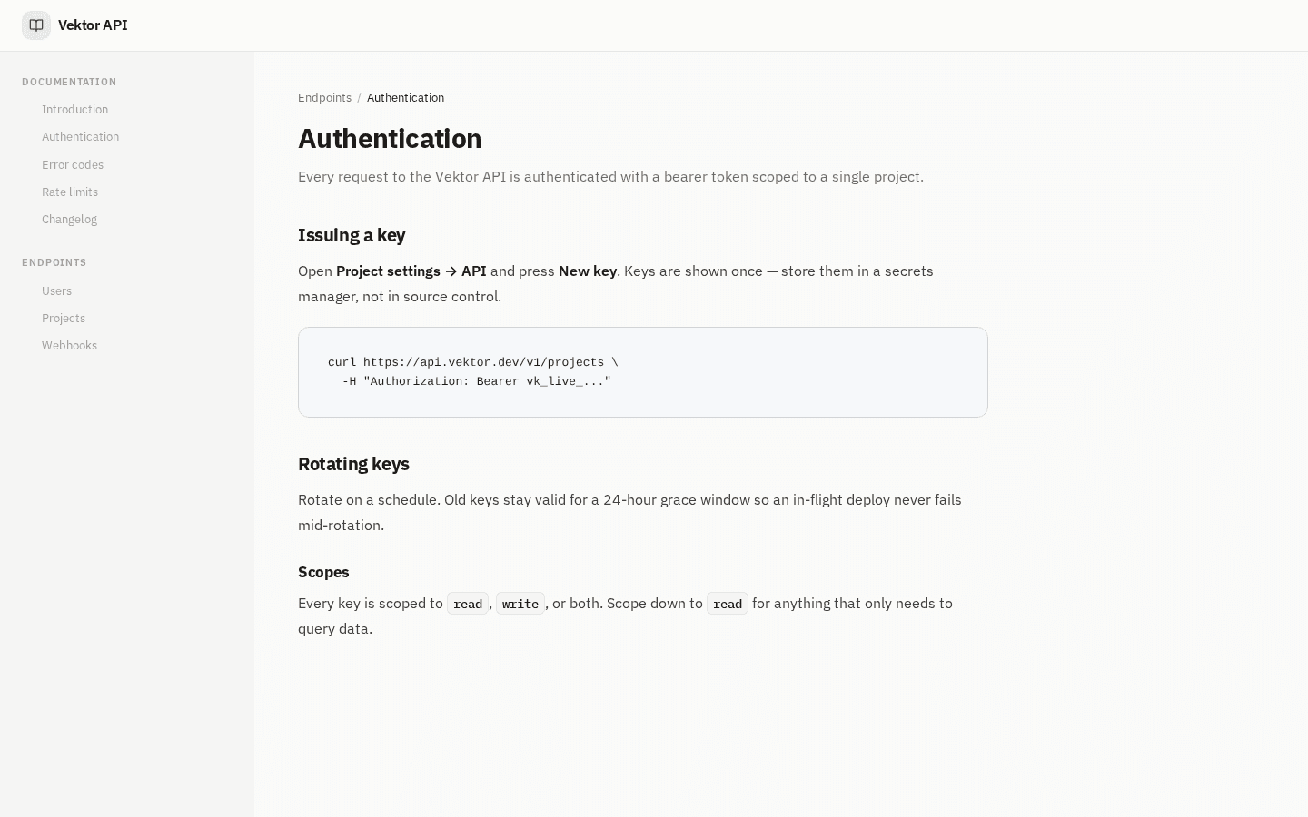
So Quarry does the opposite of what a "nicer" theme usually does:
- No ambient background at all. Every other Dokly theme has some kind of gradient or tint behind the content. Quarry is the first to use a flat, plain canvas — a corner glow reads as a brand flourish, and a reference tool shouldn't have one.
- A wide, borderless, full-bleed sidebar, built for a deep nested nav tree instead of a handful of top-level links.
- The tightest type scale of any Dokly theme. Headings are navigation anchors here, not display type, so they don't compete with the content for your eye.
- No card-grid homepage. Five of our eight themes open on a browsable grid of sections. Quarry doesn't — a reference tree is meant to be entered directly, not browsed.
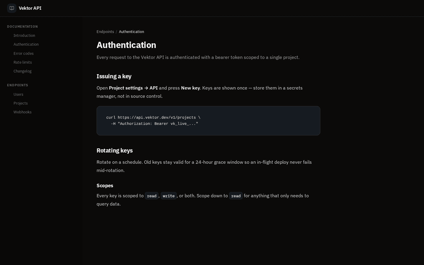
IBM Plex Sans and IBM Plex Mono throughout, deep teal accent, stone-grey canvas with white content panels floating on top — the "white card on grey app chrome" read that makes a reference site feel like a tool instead of a brochure.
Meadow: built to feel like a place, not a manual#
Meadow is the opposite brief: an internal knowledge base — HR, IT, support — where the goal is approachability, not density. Nobody opens an internal wiki wanting a terminal aesthetic; they want to find the PTO policy without feeling like they're reading a spec.
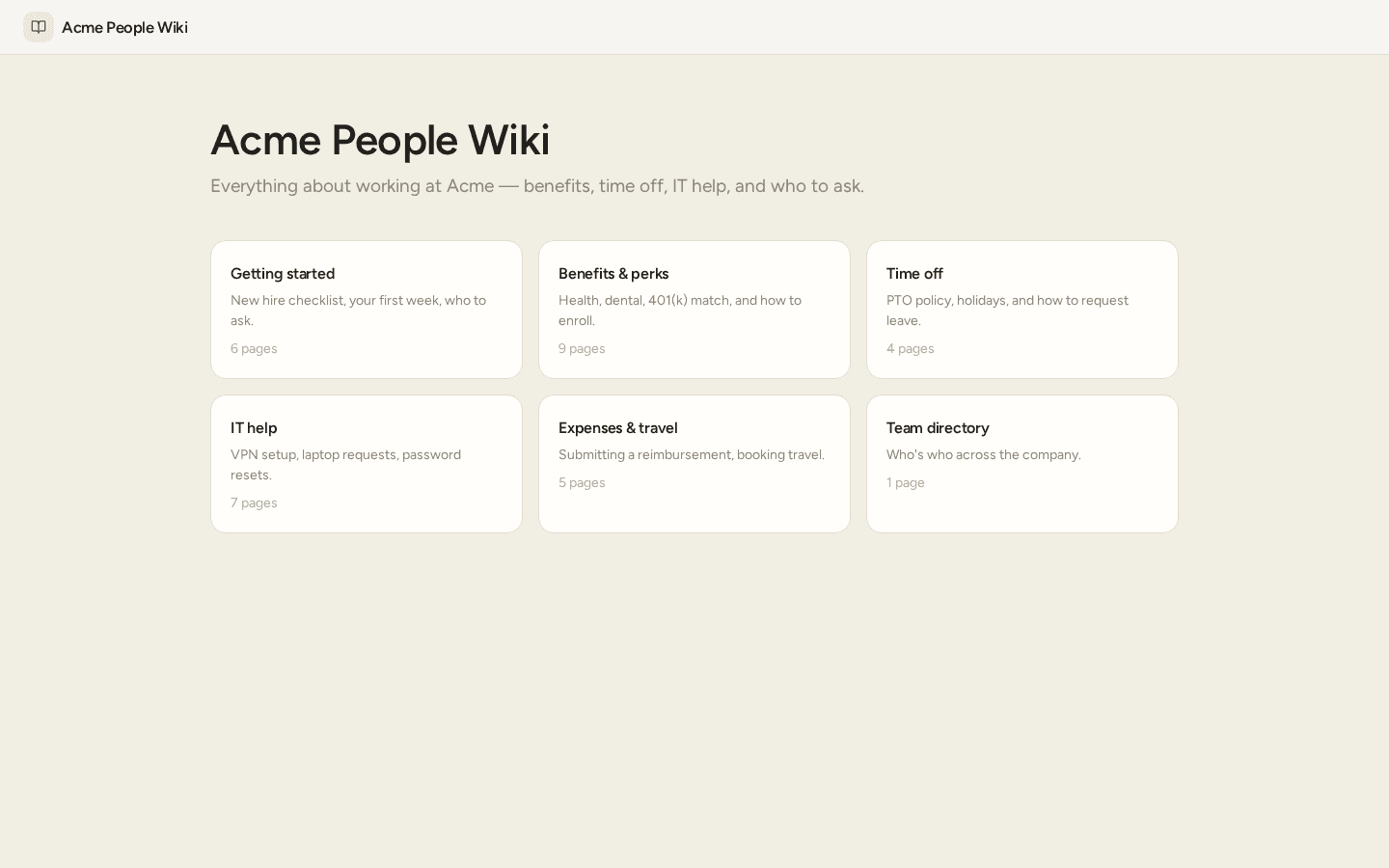
- A full-page warm wash, not a corner gradient — the first Dokly theme to use a tinted canvas across the whole page rather than a decorative layer in one spot. It reads as one continuous soft surface instead of a brand flourish sitting on white.
- The most generous type scale of any Dokly theme — a bigger, friendlier h1 than anywhere else in the lineup.
- A card-grid homepage by default. An internal wiki is something you browse by topic, not a narrative you read start to finish, so the index page is a grid of sections (Getting started, Benefits, Time off, IT help) instead of a prose column.
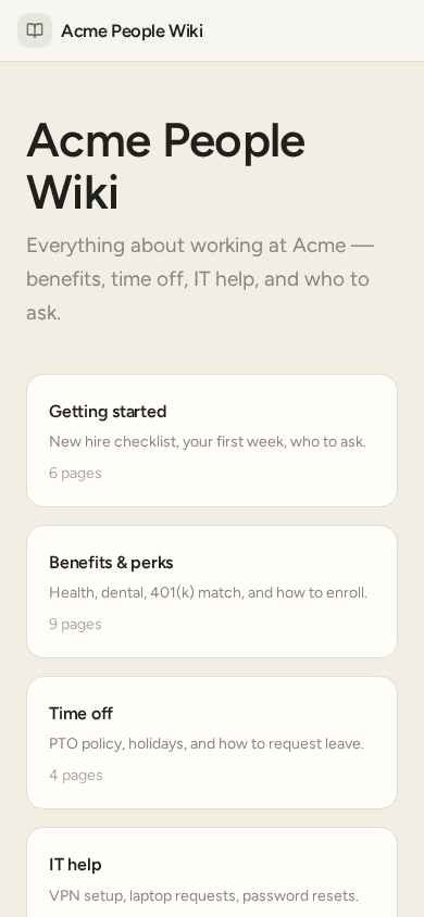
Figtree throughout, sage-green accent, soft off-white canvas — closer to Notion's wiki surfaces than to a developer-docs aesthetic, on purpose.
Why this is the interesting part, not the themes themselves#
Until this week, "background," "type scale," and "page layout" were hardcoded CSS, identical across every theme regardless of what that theme claimed to be. The actual work this quarter has been turning those three things into data — properties on a theme object instead of styles baked into a shared template. Quarry and Meadow are the proof that it worked: two themes that don't just look different, they're put together differently, from the same engine, with no special-casing.
That matters beyond these two themes. A theme that's fully describable as data is also a theme an AI agent can read and set — which is the next piece of Dokly's MCP work: giving a connected coding agent the same control over a site's look that it already has over its content.
What this deliberately doesn't do yet#
The honest gaps, because we'd rather say them than have you find them:
- Our own
/themesgallery page doesn't preview these two correctly yet. It still renders every theme through one hardcoded shell, regardless of what that theme's layout actually is — so Quarry and Meadow (and three of our six original themes) don't look structurally distinct there. The screenshots above are from real tenant-site components, not that gallery page, for exactly this reason. Fixing the gallery itself is next. - The screenshots above are mock sites, not real customers. Both themes shipped days ago; nobody's picked them yet. We built representative examples — a developer API and an internal wiki — rather than claim a customer site that doesn't exist.
- No per-project opt-out of the card-grid homepage yet, for themes that default to it.
Try them#
Every Dokly project can switch themes from the dashboard today. The full set — now eight — is at dokly.co/themes, though note the gallery-preview gap above until that's fixed.
Something about a theme look wrong once you're using it? Reply to this post or use the contact page — it reaches me directly.
Changelog entries#
Quarry theme · Added · A new documentation theme for API references and SDKs — IBM Plex throughout, flat stone canvas, deep teal accent, wide borderless sidebar, no card-grid homepage. Meadow theme · Added · A new documentation theme for internal knowledge bases — Figtree throughout, warm tinted canvas, sage accent, card-grid homepage, the most generous type scale in the lineup.