
Most advice about documentation starts too late. It tells you how to write clearer pages, pick a sidebar, or clean up stale articles. Useful, but backward. By the time you're polishing pages, you've already made the expensive decision: whether documentation is a side task or a designed system.
That distinction is more important than often realized. Bad docs usually aren't the result of bad writers. They're the result of bad structure, bad ownership, bad retrieval, and bad tooling. Teams bury key decisions in chats, let product knowledge live in people's heads, then act surprised when onboarding drags, support repeats itself, and developers ignore the docs.
Documentation design fixes the fundamental problem. It treats docs like a product surface with information architecture, UX patterns, editorial standards, contribution workflows, and feedback loops. That's the shift that separates a help center people trust from a pile of pages nobody opens unless something is already broken.
Table of Contents#
- Why Design Is the Most Important Word in Documentation
- The Three Pillars of Great Documentation Design
- Structuring Content with Information Architecture
- Designing the User Experience with Key Patterns
- Establishing Standards for Writing and Visuals
- Implementing a Modern Documentation Process
- From Afterthought to Advantage A Final Checklist
Why Design Is the Most Important Word in Documentation#
Calling documentation a writing task is one of the most common and costly mistakes in software teams. Writing matters, but it sits far downstream from the decisions that shape whether docs work: structure, retrieval, naming, navigation, page types, ownership, update paths, and interface behavior.
If a developer can't find the auth guide, if a customer support rep lands on an outdated troubleshooting page, or if a new hire has to ask three people where the definitive API reference lives, the problem isn't prose. The problem is design.
Writing is downstream of design#
The fastest way to improve documentation is usually not “write more.” It's “design less chaos.”
That sounds harsh, but the business cost is hard to ignore. Fortune 500 companies alone lose an average of $12 billion per year due to inefficiency caused by unstructured document management, and 83% of employees waste time recreating lost documents according to UseWhale's documentation statistics roundup. Those aren't edge-case failures. That's what happens when documentation is fragmented, unowned, and hard to retrieve.
Good documentation design does four jobs at once:
- Defines structure: It decides what belongs where, what content types exist, and how people move between them.
- Shapes behavior: It guides how users search, scan, test, and validate what they found.
- Sets defaults: It creates templates, standards, and workflows so contributors don't reinvent the same page every time.
- Reduces failure modes: It makes outdated, duplicated, and orphaned content less likely.
What teams get wrong#
Organizations often document reactively. They ship first, patch docs later, and call the result a knowledge base. Then they pile on fixes: more folders, more pages, more tags, more style guidance. None of that repairs a broken system.
Practical rule: If people need tribal knowledge to use your docs, you don't have a documentation problem. You have a product design problem inside your information system.
The strongest documentation systems are opinionated. They decide what a tutorial is, what a reference page is, what belongs in troubleshooting, when screenshots are required, who can publish, and what triggers updates. That level of structure can feel restrictive at first. In practice, it creates speed.
Documentation design isn't decoration. It's an operational advantage.
The Three Pillars of Great Documentation Design#
Teams often use “good docs” as shorthand for “clear writing.” That's too narrow to be useful. A documentation system works when it helps someone find the right answer, understand it quickly, and do something with it.
Those three tests are a better standard than aesthetics alone.
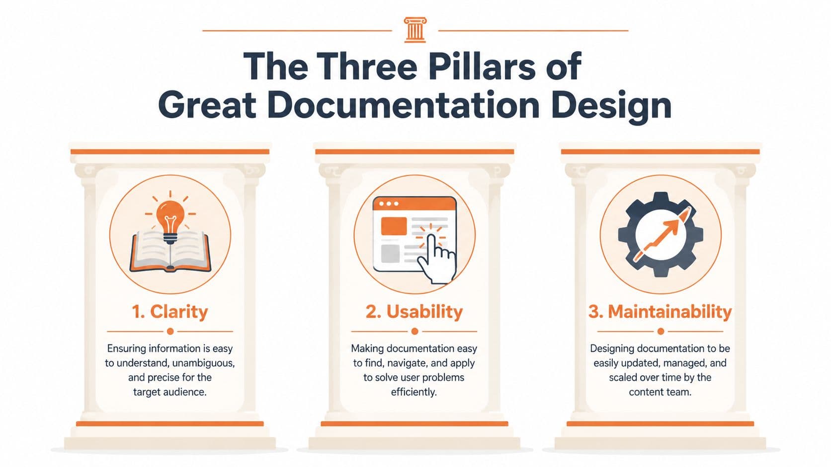
Findability#
Start with the blunt question: can users get to the answer without already knowing where it is?
That sounds obvious, but poor findability burns time across the company. Knowledge workers lose an average of 2.8 hours per week, or over 145 hours per year, searching for information according to ProProfs' documentation facts. If your search is weak, navigation is overloaded, or page titles are written for internal teams instead of user intent, your documentation design is failing before the first sentence is read.
A few practical rules help:
- Name pages by task: “Set up SSO” beats “Identity Configuration Overview.”
- Design for skim paths: Good sidebars, breadcrumbs, and local headings matter because users scan before they commit.
- Treat search terms as product language: If users search “API key reset” and your docs say “credential rotation,” they'll miss.
Comprehensibility#
Once someone lands on the page, the next question is whether the information is legible in context.
Comprehensibility isn't just plain language. It includes scope, sequencing, assumptions, and examples. Many docs are technically accurate and still hard to use because they dump everything at the same altitude. New users need orientation. Experienced users need direct access to details. Both audiences often share the same page, which is why hierarchy and progressive disclosure matter.
A comprehensible page usually has:
| Focus | What works | What fails |
|---|---|---|
| Context | A short opening that says who this is for and when to use it | Generic intros that repeat the title |
| Sequence | Steps in the order a user actually performs them | Reference details mixed into setup flow |
| Terminology | Consistent naming across product, UI, and docs | Internal shorthand that never appears in the app |
The best documentation pages answer a user's next question before they need a second tab.
Actionability#
Plenty of docs explain. Fewer help users finish.
Actionability is what turns documentation into a working tool. A page should give users enough confidence to complete a task, verify the outcome, and recover if something breaks. That means concrete steps, examples, expected outputs, edge cases, and clear next actions.
A few signs your docs are action-oriented:
- The page ends with a decision point: what to do next, not just what to read next.
- Examples are realistic: sample requests, configuration snippets, screenshots, and error states match real usage.
- Troubleshooting is built in: don't exile known failure modes to a separate graveyard of support articles.
If a page leaves readers informed but stuck, the design is incomplete.
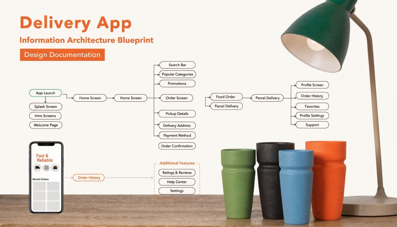
Structuring Content with Information Architecture#
Information architecture is the floor plan of your docs. It determines how content is grouped, how deep users have to dig, and whether common tasks feel obvious or buried. Teams that skip this step usually end up reproducing their org chart in the sidebar. That's one of the fastest ways to make documentation confusing.
Users don't care which team owns a feature. They care about getting something done.
Think in user routes, not folders#
Good information architecture starts with entry points. What is the person trying to do? Start integrating an API, troubleshoot a failed sync, configure permissions, migrate data, or understand limits? Those are routes. Build around them.
A practical documentation structure usually separates a few distinct jobs:
- Guides: step-by-step flows for completing a task
- Reference: exact details for APIs, fields, parameters, and behaviors
- Concepts: explanations of systems, permissions, or architecture
- Troubleshooting: known issues, causes, and recovery paths
That sounds basic, but many teams blend all four into a single page type. The result is familiar: giant pages, weak search relevance, and constant duplication.
If you're reworking a messy knowledge base, this guide on how to organize a knowledge base is a useful reference point because it pushes toward task-led grouping instead of dumping articles into broad categories.
Content models beat ad hoc pages#
The most underrated move in documentation design is defining content models before the writing starts. A content model is a repeatable page pattern with required parts. For example, every integration guide might include prerequisites, setup steps, validation, rollback notes, and common errors. Every API endpoint page might include auth requirements, request shape, response examples, and rate-limit notes.
Without content models, every contributor improvises. With them, your docs become easier to scan, easier to maintain, and harder to break.
Here's the trade-off:
| Approach | Upside | Downside |
|---|---|---|
| Free-form pages | Fast for one-off publishing | Inconsistent structure and hidden gaps |
| Strict content models | Better consistency and reuse | Requires upfront design work |
The second option wins almost every time once the docs matter to more than one team.
A folder tree is not an information architecture. It's just storage unless it maps to user intent.
The teams that struggle most with documentation design usually try to solve structural problems with more markup, more config, or more contributors. That's the wrong layer. First decide what kinds of content you publish and how users move between them. Then pick the tool.
Designing the User Experience with Key Patterns#
Documentation UX isn't a cosmetic layer. It's the mechanism that decides whether users keep moving or bounce back to search, support, or Slack. Old documentation setups often assume readers will tolerate friction because “it's just docs.” They won't.
A modern documentation experience removes hesitation. Navigation is obvious. Search is fast. API references are testable. The page helps users build momentum.
Start with the visible basics.
Navigation should narrow choices#
The old pattern is a giant sidebar stuffed with every page the team has ever published. It seems to cover everything and behaves like a maze. Users face too many options, category labels drift over time, and current context gets lost.
The modern pattern is tighter. Primary navigation handles broad areas. Sidebars stay local to the section. Breadcrumbs show location. In-page tables of contents help long pages without replacing the main hierarchy.
What works in practice:
- Local sidebars: Show only what's relevant to the current section.
- Descriptive breadcrumbs: Useful for moving upward without resetting the journey.
- Stable labels: Once users learn your language, don't keep renaming categories for internal convenience.
What doesn't work is “discoverability by abundance.” More links rarely solve confusion.
Search is part of the interface, not a utility#
Teams still treat search as a fallback, which is backwards. For many users, search is the interface.
The old way relies on exact matches, weak indexing, and generic snippets. Users type a phrase, get a stack of loosely related pages, and then stop trusting the system. Once that happens, they ask a teammate instead. Your documentation then becomes an archive, not an operating surface.
The better pattern is search tuned for intent. It should understand product terms, rank high-value pages well, and expose enough context in results for users to choose quickly. Search queries also tell you where your docs are weak. If users keep searching for an issue that has no clear landing page, that's a design failure you can act on.
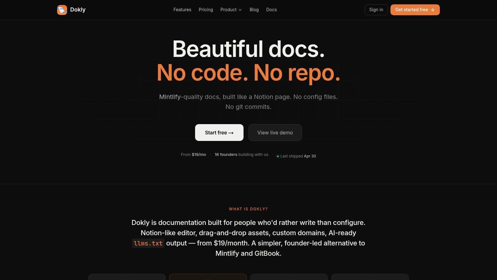
A lot of tools still make this harder than it needs to be. Docusaurus gives teams flexibility, but it often asks them to wire together plugins, structure content carefully, and maintain the experience through code. Mintlify ships a cleaner default experience, but many teams still end up operating inside the constraints of a developer-first workflow. A platform like Dokly takes a different approach: visual editing, built-in search, OpenAPI imports, analytics, and publishing without touching config files or repos. For startups and mixed teams, that changes who can maintain the docs.
Later in the workflow, product demos help. The official Dokly walkthrough gives a good sense of how a modern documentation interface should feel in use:
API docs need interaction, not just reference#
Older documentation setups feel the most outdated in this regard. Static API references still dominate because they're easy to generate, but they're weak at helping developers confirm understanding. Reading an endpoint isn't the same as using it.
Interactive playgrounds are the current baseline for good API documentation design. Developers should be able to inspect endpoints, understand auth requirements, test requests, and see responses in one place. That shortens the path between reading and verifying.
Compare the two approaches:
| Pattern | Reader experience |
|---|---|
| Static endpoint list | Read, switch tools, test elsewhere, come back if confused |
| Interactive reference | Read, test, inspect, and iterate in one flow |
If your API docs require a second tool before a developer can validate the first request, you've added friction at the exact moment confidence matters most.
The same logic applies outside APIs. Onboarding flows, setup guides, and troubleshooting pages should all reduce the gap between understanding and action.
Establishing Standards for Writing and Visuals#
Standards get framed as bureaucracy by people who've never had to clean up a large documentation set. In practice, standards remove pointless choices. They stop every contributor from inventing a new voice, page shape, screenshot style, or terminology set.
That doesn't make docs rigid. It makes them usable.
Standards reduce decision fatigue#
A solid documentation standard usually covers five things: tone, terminology, page templates, visual rules, and review criteria. That's enough to create consistency without turning the docs into a style-policing exercise.
The tone rule can be simple. Use direct language. Name the actor. Explain why something matters before dropping details. Avoid marketing copy in instructional pages. If users came to docs to complete a task, they don't want positioning language in the way.
Visual standards matter just as much. Screenshots should have a purpose, not just presence. Diagrams should clarify relationships, not decorate the page. Callouts should be reserved for critically important warnings, not sprinkled everywhere until nothing stands out.
A practical standard library often includes:
- Page templates: setup guide, feature guide, API reference, troubleshooting article
- Terminology list: approved product terms and banned synonyms
- Screenshot rules: when to use full-screen captures, crops, annotations, and alt text
- Review checklist: accuracy, clarity, completeness, and update owner
If your team needs examples of what strong technical content looks like in practice, this collection of technical writing examples for 2026 is a useful benchmark for page shape and clarity.
Accessibility belongs in the default workflow#
Accessibility is where a lot of documentation teams become vague. They say it matters, then treat it like a final review item. That's too late.
The more useful view is simple: accessible docs are easier docs. Clear heading structure helps screen readers and scanners. Descriptive link text helps everyone. Good color contrast helps in bright offices, low-light environments, and tired eyes as the workday concludes. Captions, alt text, and keyboard navigability are not edge-case features.
There's also a planning gap in the broader conversation. Many guides mention accessibility, but they rarely provide a quantitative framework for ROI, which is a major issue for teams in regulated markets that need to justify the work beyond compliance, as noted in UXPin's discussion of design system documentation mistakes. That doesn't make accessibility optional. It means teams should stop waiting for perfect ROI math before fixing obvious barriers.
Accessible documentation isn't a separate version of your docs. It's what happens when your default design choices respect more than one kind of reader.
Teams can also use editing support to keep standards from slipping. Inline writing tools such as the Dokly AI writer can help simplify dense sentences, tighten grammar, and make rough drafts easier to normalize before review. The value isn't automation for its own sake. It's reducing the editorial cleanup that slows publishing.
Implementing a Modern Documentation Process#
A lot of documentation problems aren't content problems at all. They're workflow problems. The team has good knowledge, willing contributors, and clear product decisions. But the publishing path is so awkward that only a few people can touch it safely. Docs lag behind because the system punishes contribution.
That's why process matters more than another style guide.
The old workflow creates bottlenecks#
The old setup is familiar. Documentation lives next to code, inside repos that non-engineers avoid. Publishing depends on pull requests, local setup, config files, and someone technical having spare time. Docusaurus and Mintlify can both produce polished results, but for many startups the day-to-day trade-off is obvious: every docs update competes with engineering attention.
That model breaks once PMs, support, success, and marketing need to contribute regularly. If a support lead spots a broken setup step but has to open a PR or wait for a developer, the workflow is wrong.
What a healthier process looks like:
- Low-friction editing: the people with the knowledge can update the page directly
- Review without gatekeeping: subject matter review stays strict, publishing mechanics stay simple
- Shared ownership: docs aren't “the writer's job” or “the dev rel job” alone
- Visible feedback loops: search queries, page behavior, and missing-answer signals drive backlog updates
This overview of knowledge base management is a good reference if you're redesigning ownership and maintenance rather than just the site itself.

Pre-documentation changes delivery quality#
The best documentation process starts before release notes and help articles. It starts in planning.
Structured technical specs are a form of pre-documentation. They force teams to define scope, business logic, dependencies, API changes, and assumptions before implementation drifts. That pays off beyond engineering hygiene. Teams using structured technical specifications reduce integration bugs by 40% and accelerate delivery by 25%, according to Stack Overflow's practical guide to writing technical specs.
That result lines up with what experienced teams already know. When the thinking is documented early, the eventual user-facing docs are easier to produce because the core decisions already exist in a usable form.
A simple progression works well:
- Spec the change early: define the behavior, dependencies, and non-goals.
- Map doc impact before launch: what needs a guide, what needs reference updates, what needs troubleshooting notes.
- Assign doc ownership with release ownership: if someone ships it, someone owns the explanation.
- Publish updates as part of the release checklist: not as an afterthought.
Measure behavior, not publishing volume#
A lot of teams track output because it's easy. Number of pages published. Number of words added. Number of articles updated. None of those tell you whether the documentation system is helping users.
The better signals are behavioral. What do people search for? Where do they drop off? Which pages get heavy traffic but low task completion confidence? Which queries produce weak results? Those are design inputs.
A useful docs review cadence asks:
| Question | Why it matters |
|---|---|
| What are users searching for repeatedly? | Repeated queries often reveal weak navigation or missing pages |
| Which pages attract support-linked traffic? | These pages should be especially accurate and easy to scan |
| Where do readers stall? | High exits on critical flows often signal unclear next steps |
Good process turns documentation into a maintained product surface. Bad process turns it into a cleanup project that never ends.
From Afterthought to Advantage A Final Checklist#
The largest shift in documentation design is not visual. It's organizational. Teams that treat docs as a post-launch writing task keep paying for the same failure in different forms: repeated questions, delayed onboarding, fragmented knowledge, and brittle releases.
The more effective model is to design documentation as part of the system from the start. That's also where the biggest strategic gap still sits. The biggest gap in documentation strategy is treating it as a post-launch activity rather than a system design challenge, and stronger teams build documentation into their systems from the front end to avoid documentation debt, as argued in this piece on documentation strategy and design.
The shift that changes everything#
Once you accept that premise, a lot of choices become easier.
You stop asking, “Who has time to write docs?” and start asking, “How do we make accurate documentation the default output of product work?” You stop measuring success by publishing volume and start measuring whether users can find, understand, and complete tasks. You stop tolerating workflows that lock docs behind technical bottlenecks.
That is what turns documentation from maintenance overhead into an advantage.
Teams don't get good documentation by caring more. They get it by designing a system that makes good documentation easier to produce than bad documentation.
Documentation design checklist#
Use this as a working checklist, not a maturity theater exercise.
- Define the jobs your docs must perform: onboarding, setup, API reference, troubleshooting, internal enablement, or all of the above.
- Map user routes before page trees: organize around tasks and decisions, not departments.
- Create content models: decide what every guide, reference page, and troubleshooting article must contain.
- Simplify navigation: keep categories stable, local, and tied to user intent.
- Treat search as a core surface: review search terms regularly and create landing pages for repeated queries.
- Design for action: include prerequisites, steps, examples, validation, and recovery paths.
- Set writing and visual standards: tone, terminology, screenshot rules, and review criteria should be explicit.
- Build accessibility into defaults: headings, alt text, contrast, link text, and keyboard-friendly interaction shouldn't be left for later.
- Connect docs to delivery: make doc updates part of specs, release planning, and launch checklists.
- Choose tools that lower contribution friction: the right platform expands who can keep docs current.
- Measure behavior: search data, page usage, and reader friction reveal what needs work.
- Assign ownership clearly: every important page should have someone responsible for accuracy.
If a team follows even half of that with discipline, documentation quality usually improves fast. Not because the writers suddenly got better, but because the system stopped fighting them.
If you're rebuilding your documentation stack, Dokly is worth a look. It gives teams a visual way to publish public docs, API references, help centers, and knowledge bases without working through repos or config files, which makes it practical for founders, PMs, support teams, and developers to maintain one documentation system together.
Authored using the Outrank app