This week's editor work was almost entirely about one thing: giving you more block types to write with. Six shipped in seven days. The newest, Tree, hasn't had its own post yet — here's what it does, plus a quick recap of the other five in case you missed them.
New: a file-tree diagram#
Explaining a project's folder structure in prose ("there's a src folder with a components folder inside it, and...") is worse than just drawing it. Tree draws it:
Build it with Tree.Folder (collapsible, can nest as deep as you need) and Tree.File (a leaf). The syntax:
<Tree>
  <Tree.Folder name="app" defaultOpen>
    <Tree.File name="layout.tsx" />
  </Tree.Folder>
</Tree>
A folder opens collapsed by default — add defaultOpen to show its contents right away, the way the example above starts expanded. Pass highlight on any folder or file to tint the one row you want a reader's eye to land on. Set openable={false} on a folder you want to show as a flat label with no expand/collapse affordance at all — useful for a folder that's just there for context, not something to explore.
That's 21 top-level components now, up from 11 a couple of months ago. Two named gaps left on the list: Panel and Tooltips.
The other five, in case you missed them#
Each of these shipped its own post this week — linking here rather than repeating the detail:
- Frame — wraps a screenshot, diagram, or terminal output with an optional label above and caption below, so it reads as a labeled figure instead of a loose image.
- Columns — lays content side by side, 1 to 4 columns, for comparisons that don't need a full table.
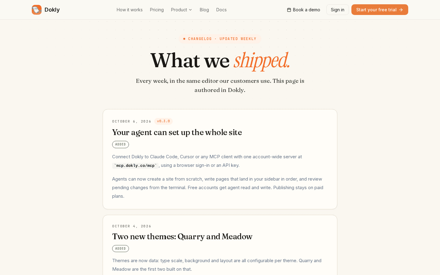
- Update — a labeled block for a hand-written changelog or release-note entry, the same primitive this very post's changelog section below could be written in.
- ParamField and ResponseField — document a request parameter or response field as its own row, with type, required flag, and description, so an API reference page doesn't have to spell that out in prose.
- Icon — a small inline icon for calling out a UI element mid-sentence, without breaking for a screenshot.
What's next#
Panel and Tooltips are the last two named gaps in the component library, and one of them is next. After that, the plan is to give your connected AI agent control over how a site looks — theme, fonts, branding — the same way it already controls page content and site structure today.
Something you keep working around? Reply to this post or use the contact page — it reaches me directly.
Changelog entries#
Tree component · Added · A file-tree diagram block (Tree, Tree.Folder, Tree.File) for showing a project's directory structure, with collapsible folders and optional row highlighting.