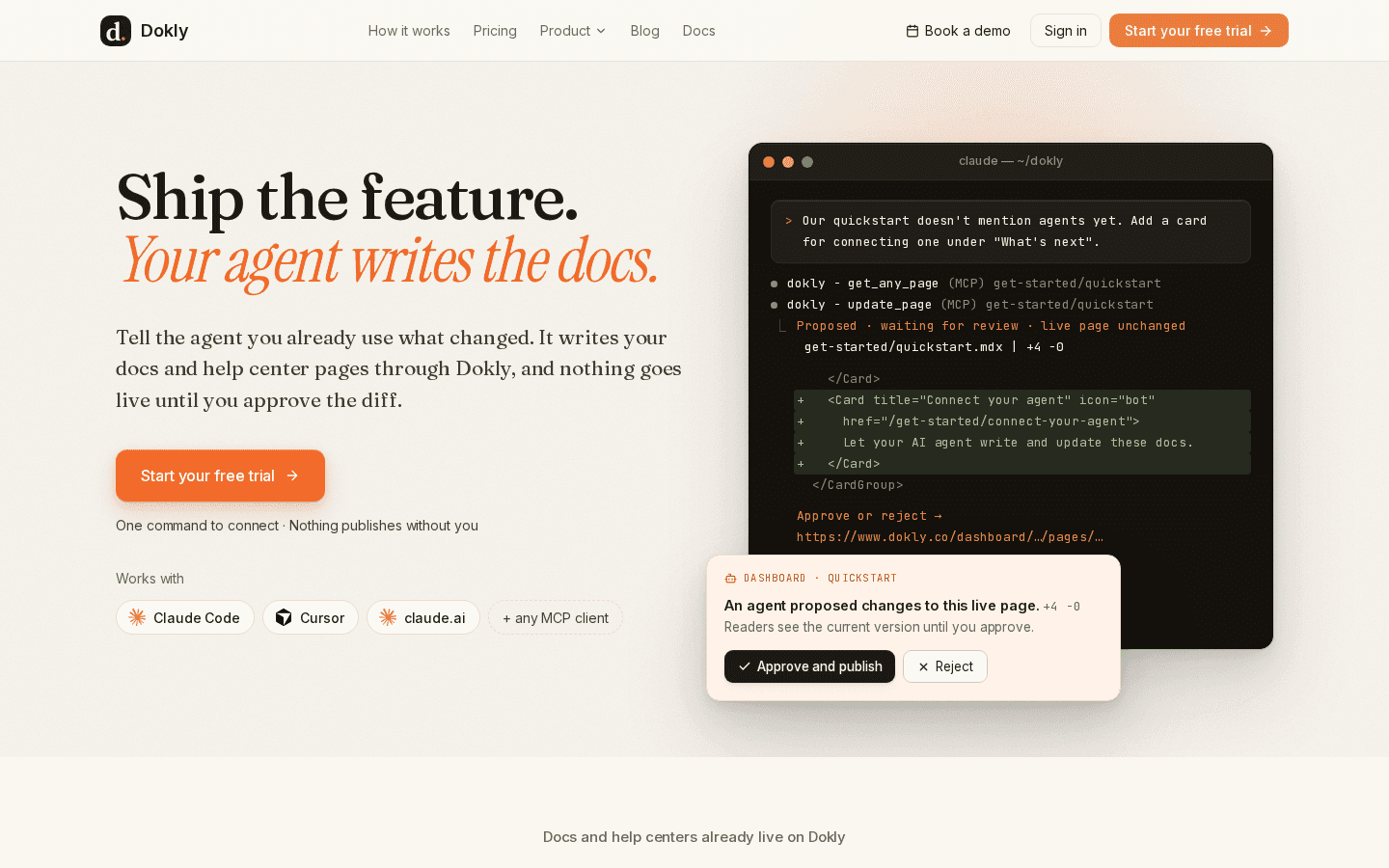
The biggest change this week is one you'll notice the moment you look at Dokly: a new mark, and the dashboard finally looking like one consistent product end to end — not a redesigned editor bolted onto old forms.
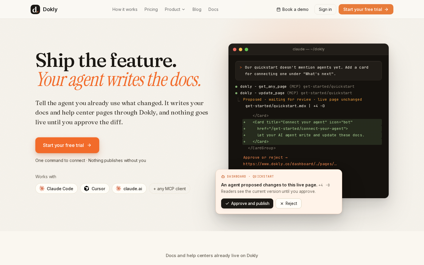
A new mark#
The old logo — a blue scroll on an orange gradient — predated the current look and had started to feel out of place next to it. It's been replaced everywhere: the nav, the footer, login, onboarding, your browser tab, and every page's link preview. The new mark is a simple lowercase "d." in cream on ink, legible even shrunk down to a favicon.
The dashboard's last rough edges got the same treatment#
A few weeks ago we rebuilt the page editor's look and feel. What didn't get touched at the time was everything around the editor — plainer forms and dialogs that still looked like a different product. This week we went through what was left:
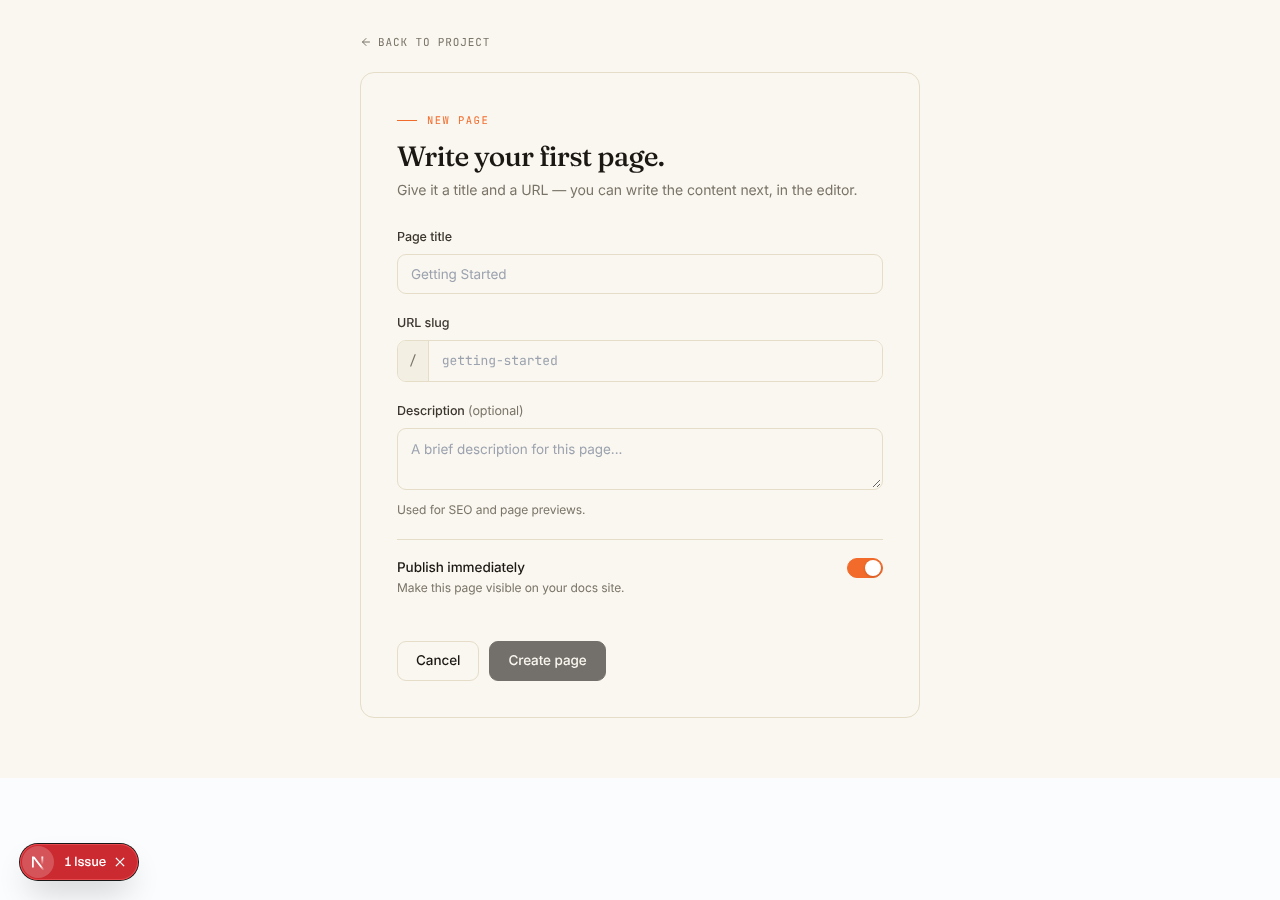
- Creating a new page now matches the rest of the dashboard, instead of standing out as the one plain form on the way in.
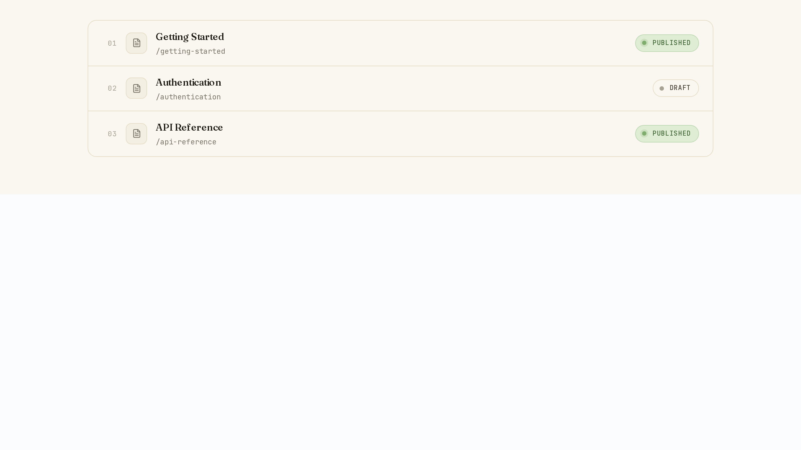
- Marking a page published or draft is now a single, clear pill instead of a bare toggle switch.
- The feedback button available on every dashboard page, the API Playground's request builder, and the error page you'd see if something went wrong all got the same pass — small on their own, but they're surfaces you can run into on any given day.
None of this changes what any of these do. It's purely that opening a form, flipping a toggle, or hitting an error page should feel like the same product you're writing docs in, not a leftover corner of an older one.
Link previews on X are fixed#
If you'd shared a Dokly link on X recently, the preview card came back blank — our own robots file was quietly blocking the image that generates those previews from search engines and social bots alike. That's fixed, and the default preview card is redesigned to actually show what Dokly does instead of plain text on a cream background.
What's next#
With the editor and the dashboard now visually consistent, the next stretch of work is the first ten minutes of actually using Dokly — onboarding, the first-run dashboard, and what you see before you've written anything yet. After that, the next big push is getting Dokly's MCP server in front of more agents and developers directly.
Something you keep working around? Reply to this post or use the contact page — it reaches me directly.
Changelog entries#
New Dokly mark · Changed · Replaced the logo and favicon everywhere, including browser tabs and link previews. Dashboard forms and dialogs · Changed · The new-page form, publish toggle, feedback widget, API Playground, and error pages now match the rest of the dashboard's look. Link previews on X · Fixed · Sharing a Dokly link on X now shows a real preview card instead of a blank one.