If anyone reads your docs on a phone, this one's for them.
Mobile nav now groups into sections#
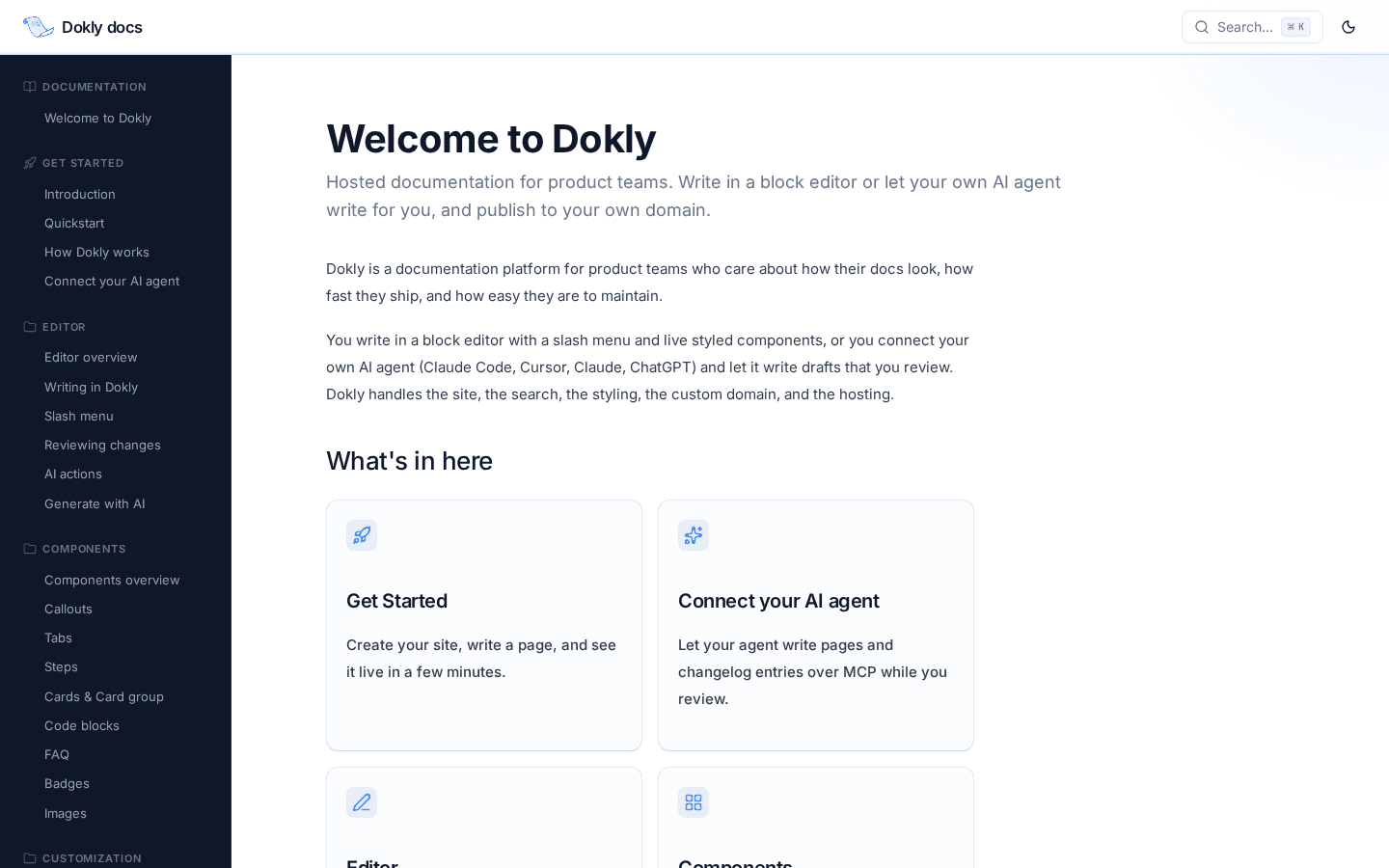
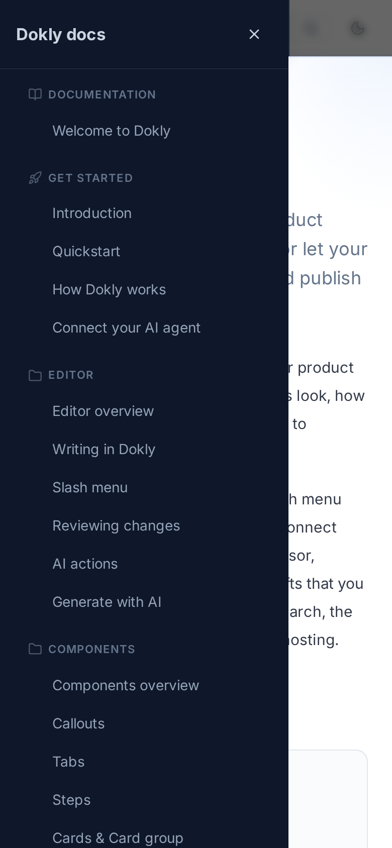
On desktop, your sidebar has always grouped pages into labeled sections with an icon per section — "Get Started," "Editor," "Components," and so on. On a phone, that same site showed every page as one flat list under a generic "Documentation" header, with no sections and no icons.
That's fixed. The mobile menu now builds the same section structure as desktop: a page with sub-pages becomes a labeled section with its own icon, pulled straight from the section title. Pages with no children sit together under "Documentation," shown only when real sections exist elsewhere — so a simple, flat site still gets a clean single list instead of an empty header.
Nothing to turn on. If your site already has sections on desktop, your phone just caught up.
A few more dashboard corners got the visual pass#
A few weeks ago the editor and the pages around it (new-page form, publish toggle, feedback widget, API Playground, error pages) got pulled into Dokly's current look. This week closed two more gaps in that sweep:
- Settings → Branding's theme picker — the cards you pick your site's theme from now match the rest of Settings instead of standing out as leftover default styling.
- The OpenAPI spec import dialog in API Playground — the drag-and-drop/paste flow for importing a spec now matches the rest of the Playground.
Neither changes what these do — just what they look like while you're doing it.
What's next#
The editor and dashboard redesign is in its last stretch. After it wraps, the next focus is the first ten minutes of actually using Dokly — onboarding, the first-run dashboard, and what a brand-new project looks like before you've written anything. After that: getting Dokly's MCP server in front of more agents and developers directly.
Something you keep working around? Reply to this post or use the contact page — it reaches me directly.
Changelog entries#
Mobile doc site nav · Changed · The mobile menu now groups pages into labeled sections with icons, matching the desktop sidebar, instead of one flat list. Settings theme picker · Changed · The Branding theme-picker cards now match the rest of Settings' visual style. OpenAPI import dialog · Changed · The API Playground's spec-import dialog now matches the rest of the Playground's visual style.