Most advice about how to improve readability is stuck in the web of ten years ago. It treats readability as a visual polish job for human readers: shorter paragraphs, simpler words, better fonts, more white space. That still matters. It's also incomplete.
In 2026, the first reader of your docs often isn't a person. It's an AI system deciding whether your page is understandable enough to quote, summarize, retrieve, or recommend. If your documentation looks clean to a human but ships messy structure underneath, you haven't made it readable. You've made it presentable.
That distinction changes everything. Good readability now has two jobs. It has to help a tired human skim fast and act confidently. It also has to help an LLM parse the page without guessing what your headings, lists, examples, and code blocks mean.
Table of Contents#
- The Readability Gap Why Your Docs Are Invisible to AI
- Writing Prose That People Actually Finish
- Structuring Content for Scannability and Parsing
- Measuring What Matters Beyond Readability Scores
- The Modern Readability Workflow and Toolset
- Your Readability Checklist for 2026
The Readability Gap Why Your Docs Are Invisible to AI#
The old assumption is simple: if a human can read it, the job is done. That assumption breaks the minute an AI agent becomes the first system to interpret your docs.
The core problem is an AI-first readability gap. Traditional guidance focuses on visual comfort for people and largely ignores machine parseability. Yet the current reality is that documentation is often first consumed by systems like ChatGPT, Claude, and Cursor before a human ever lands on the page. The American Library Association accessibility discussion points to this blind spot and the emerging role of machine-oriented standards like structured MDX and llms.txt in modern documentation workflows, while older readability guidance barely mentions them at all (ALA readability accessibility perspective).
A lot of teams have already felt the symptom even if they haven't named the cause. Their docs look polished. Their product is solid. But AI tools don't cite them, support bots don't retrieve the right answers, and search summaries skip over them.
Docs can fail readability without looking bad. They fail when the structure is ambiguous, the hierarchy is fake, or the content is trapped inside rendering patterns that machines flatten into noise.
That's why I no longer treat readability as a copyediting problem alone. It's an information architecture problem and, increasingly, a publishing-format problem.
One useful outside perspective is GitDocAI's approach to AI docs. The value in that piece isn't hype. It's the practical framing that you don't need to choose between human-friendly and AI-friendly docs if the underlying structure is sound.
What doesn't work anymore:
- Visual-first page building: Blocks that look organized on screen but hide weak semantics underneath.
- Heading abuse: Bold text styled to look like headings without actual heading hierarchy.
- Collapsed context: Tabs, accordions, and embedded widgets that bury key explanations.
- Copy pasted policy prose: Dense language written for approval chains, not comprehension.
What works is boring in the best way. Clear headings. Explicit sections. Short explanatory paragraphs. Real lists. Predictable markup. Human-readable language sitting inside machine-readable structure. That's what makes a document readable now.
Writing Prose That People Actually Finish#
Organizations often overestimate how much complexity readers will tolerate. They think dense prose signals authority. In practice, it often signals friction.
There's a useful benchmark here. Reducing a document's readability level from grade 12 to grade 5 leads to an 83% increase in completion according to AutoCrit's readability statistics summary. That number matters because it reframes simplification. Clearer prose isn't about flattening ideas. It's about removing the decoding tax.
Start with the sentence, not the style guide#
Bad readability usually starts at sentence level. You see it in passive construction, abstract nouns, and overloaded clauses.
Compare these:
- Dense: The implementation of the revised onboarding process was facilitated by the operations team in order to ensure the optimization of cross-functional alignment.
- Readable: The operations team revised onboarding so each team follows the same process.
The second version says more with less. It also gives both humans and machines a cleaner subject, action, and object.
A practical editing pattern that consistently improves technical prose:
- Replace abstract nouns with concrete nouns
- Replace passive verbs with active verbs
- Add the person, team, or system doing the action
- Shorten the sentence until the point is obvious
That sequence comes straight out of good technical writing practice and it works because it removes ambiguity instead of decorating around it.
What to cut first#
When I review docs, these are usually the first things I remove:
- Ceremonial language: “In order to,” “it should be noted,” “with respect to”
- Soft verbs: “facilitate,” “enable,” “support” when a stronger verb exists
- Noun piles: “customer account access request workflow status”
- Buried actions: when the main verb appears halfway through the sentence
Practical rule: If a sentence hides the actor or delays the action, rewrite it.
Human readers abandon this kind of prose because it's tiring. AI systems struggle with it for a similar reason. The relationship between actor, action, condition, and exception gets muddy fast.
A good companion resource on this point is RewriteBar's writing clarity guide. It focuses on the mechanics of cleaner expression, which is where most readability gains start.
Simpler prose doesn't mean thinner prose#
At this point, many writers get nervous. They hear “simplify” and assume “remove detail.” That's the wrong trade-off.
Keep the detail. Simplify the delivery.
Instead of compressing everything into one paragraph, separate the ideas:
- State the rule clearly
- Add the exception in the next sentence
- Give the example after that
- Link to reference material only if the reader needs more depth
A solid technical writing style guide helps teams stay consistent here. This technical writing style guide from Dokly is useful because it pushes writing toward clarity instead of faux formality.
Here's the simplest test I use: if a support rep, operations manager, or new hire can read a paragraph once and act correctly, the prose is doing its job. If they need to reread it, translate it, or ask what it “really means,” it isn't.
Structuring Content for Scannability and Parsing#
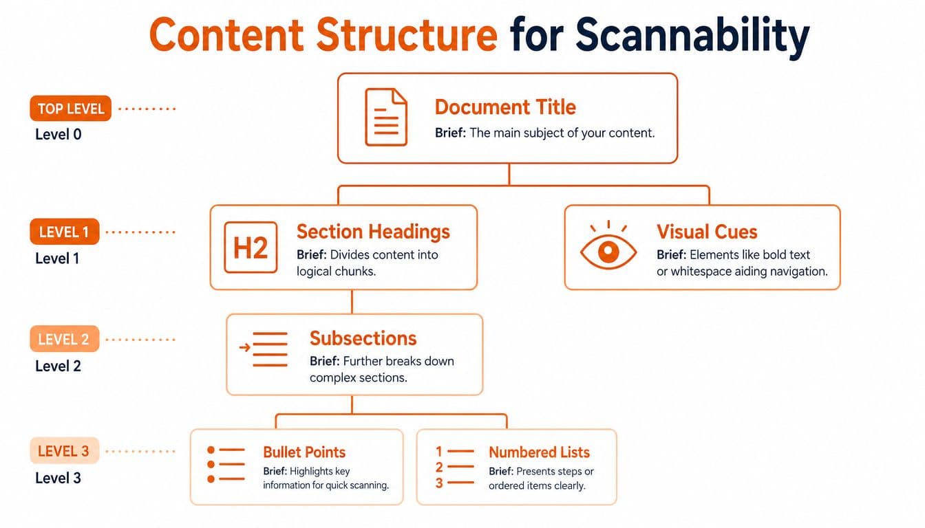
Readable sentences inside a badly structured page still lose. People scan before they read. Machines chunk before they interpret. Both depend on structure.
Make the hierarchy obvious#
Good structure starts with one decision: each section gets one job.
That sounds basic, but many docs still mix policy, explanation, edge cases, and procedural steps under a vague heading like “Overview” or “Details.” A reader can't scan that. A model can't reliably chunk it either.
Best practices for readability include chunking content into sections with one main idea per section, using descriptive subheadings, using visuals to break up text, and limiting line length to 45–72 characters per line, as summarized by Intechnic's readability guidance.
Here's the difference between weak and strong hierarchy:
| Weak structure | Strong structure |
|---|---|
| “Information” | “Who can approve access requests” |
| “Process notes” | “Steps to submit a refund request” |
| “More details” | “When the policy doesn't apply” |
A heading should preview the answer, not merely label a topic.
If your team struggles with logical sequencing, the Pyramid Principle in writing and thinking is a practical way to force stronger structure. It's especially useful for SOPs, help center articles, and internal knowledge bases where readers arrive with a specific task.
Format for scanning, not decoration#
Most pages become harder to read because the formatting tries to look designed instead of trying to be useful.
Use formatting that signals meaning:
- Bullets for grouped items
- Numbered lists for sequence
- Short paragraphs for explanation
- Tables for comparisons
- Bold only for labels or key terms
Avoid formatting that only adds visual noise:
- Decorative callouts with no new information
- Long accordion stacks
- Overstyled code tabs
- Paragraphs broken by random bold phrases
If a user lands mid-page from search, the structure should tell them where they are, what this section covers, and what action comes next.
A few practical rules help a lot:
- Keep sections narrow: one topic, one outcome.
- Keep paragraphs short: stop before the wall of text starts.
- Use lists aggressively: not because lists are trendy, but because grouped information is easier to scan and easier to parse.
- Write subheadings that carry meaning: “Resetting MFA on mobile” is better than “Mobile.”
Readable structure feels slightly plain. That's a feature. Plain structure survives skimming, copy-pasting, indexing, and summarization. Fancy layout often doesn't.
Measuring What Matters Beyond Readability Scores#
Readability scores are useful. They're also easy to misuse.
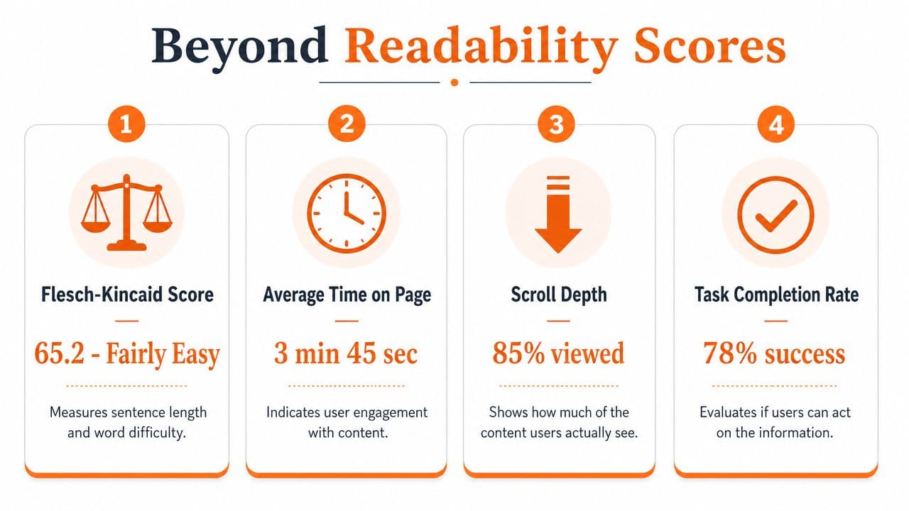
A lot of teams treat a score as the finish line. It isn't. It's a quick signal about sentence length and word difficulty, not a verdict on whether the document works.
Use score ranges as a floor#
A sensible target for general accessibility is a Flesch-Kincaid score between 60 and 70. Below 60, the text moves into “difficult” territory, as outlined in the North Carolina Bar article on readability statistics.
That target gives you a baseline. It catches some common problems fast:
- Sentences that run too long
- Vocabulary that's needlessly formal
- Paragraphs doing too much work
- Legal or academic phrasing creeping into operational content
But score chasing creates its own problems. I've seen teams shorten every sentence until the page reads like a telegraph. I've also seen writers remove necessary terms just to nudge the number up. Both moves hurt comprehension.
A readability score should start an edit, not end one.
Useful measurement asks a better question: can the intended reader complete the task correctly after reading the page once?
For teams that care about support content, SOPs, product docs, and onboarding material, that means pairing score checks with outcome checks. This documentation analytics and metrics guide from Dokly is a good reminder that engagement and usefulness don't always show up in readability formulas.
Add a parseability review#
This is the missing metric in most discussions about how to improve readability.
A page can score well on Flesch-Kincaid and still fail at machine readability if the structure is weak. You need to inspect things the score can't see:
- Does the page have a real heading hierarchy?
- Are lists marked up as lists or faked with symbols?
- Are code examples exposed cleanly?
- Does the page preserve section meaning when stripped of styling?
- Can an AI system identify definitions, steps, warnings, and examples without guessing?
My preferred test is brutally simple. Strip the page down to text and headings. If the meaning collapses, the original page was doing too much with presentation and not enough with structure.
That's the shift in 2026. Human legibility still matters. Machine parseability now matters just as much. A page that performs well on both is readable in the modern sense.
The Modern Readability Workflow and Toolset#
The old documentation workflow creates readability problems before anyone edits a sentence.
A team drafts in Google Docs or Notion, pastes into a docs platform, wrestles with theme settings, adds interactive elements, and publishes something that looks polished. Under the surface, the output often turns into structure-light markup, hidden metadata, or block-heavy rendering that machines don't interpret cleanly.
Why old workflows break readability#
At this point, the AI-first problem stops being theoretical.
Research cited by Speakeasy indicates that 73% of LLMs fail to parse correctly when content is rendered in opaque editor blocks without structured metadata, which is why semantic MDX has become a practical requirement rather than a nice-to-have (Speakeasy on docs vendor choices and machine-readable formats).
That failure mode shows up in a few predictable ways:
- Rendered soup: Pages look fine in the browser but flatten poorly for retrieval systems.
- Pseudo-structure: Visual blocks imitate hierarchy without exposing real semantics.
- Fragmented authoring: Writers edit in one tool, publish in another, and lose structural integrity in the handoff.
- Heavy setup tax: Platforms like Docusaurus can be powerful, but many teams don't want a documentation stack that behaves like an engineering side project.
Mintlify often enters this conversation because it delivers attractive docs fast. That's the appeal. The trade-off is that attractive output alone doesn't guarantee machine-friendly output. If your priority is citation, retrieval, and AI recommendation, pretty isn't enough.
What a better workflow looks like#
A modern workflow should do three things by default:
- Preserve semantic structure from draft to publish
- Help writers simplify prose while writing
- Expose content in formats machines can chunk reliably
That's why I care less about whether a platform has the most templates and more about whether it protects readability at the publishing layer.
For writing itself, inline simplification tools are useful when they stay focused on clarity instead of marketing fluff. A tool like Dokly AI Writer fits that workflow because it helps rewrite, expand, and simplify without forcing a separate editing pass.
The same goes for support tooling around readability. Dokly's tools library is worth browsing because the value is practical. Reduce friction. Clean up prose. Publish faster.
There's also a developer-docs angle that old readability advice misses. Interactive references are often easier to read than static endpoint dumps because they turn abstract API language into testable behavior. That matters for comprehension, not just convenience.
A quick look at the editor workflow helps make this concrete:
The useful takeaway isn't that one platform has nicer UI than another. It's that the best readability improvements come from workflow choices that prevent bad output in the first place. If your toolchain forces writers to fight formatting, structure drift, and publishing quirks, readability becomes a cleanup task. If the workflow preserves clean structure automatically, readable docs are the default.
Your Readability Checklist for 2026#
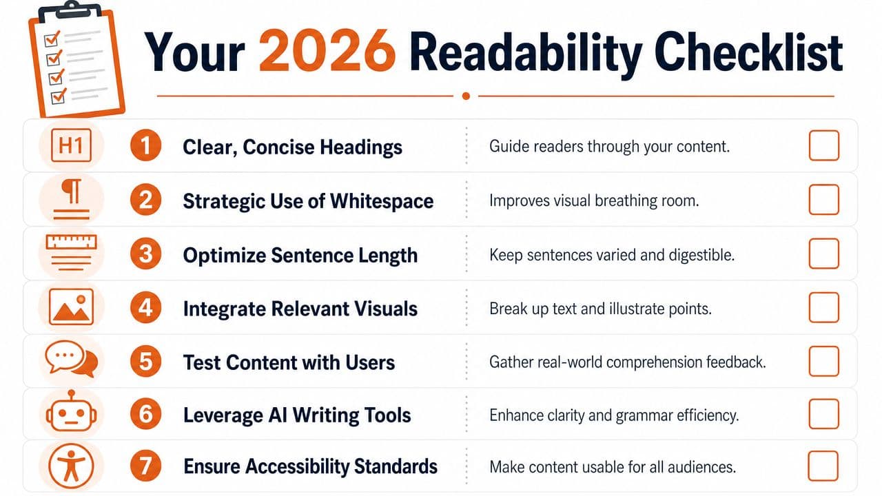
By now the pattern should be clear. Readability is no longer just a writing skill. It's a combined discipline of prose, structure, and machine-facing publication.
Prose checks#
Run these on every page before publishing:
- Use direct actors: Name the team, user, or system doing the action.
- Cut ceremonial phrasing: Remove filler that delays the point.
- Keep terms precise: Use technical language when needed, but define it fast.
- Split layered ideas: Rule first, exception second, example third.
If a paragraph feels formal but says little, it probably needs rewriting.
Structure checks#
Most readability failures live here.
- Check heading logic: Each heading should preview the content below it.
- Use one idea per section: Don't mix policy, procedure, and rationale in a single block.
- Prefer lists over compressed prose: Especially for steps, criteria, and edge cases.
- Audit scan paths: A reader should understand the page by reading only headings and bullets.
Good structure reduces re-reading. Great structure reduces wrong action.
For mobile readers, this matters even more. Dense content can still be deep if the hierarchy is strong and the chunks are disciplined.
Platform checks#
This is the part many teams skip, and it's where modern readability succeeds or fails.
Ask these questions:
- Does your platform preserve semantic headings and lists?
- Can you publish clean, machine-readable pages without manual cleanup?
- Does the page still make sense when styling is stripped away?
- Can AI systems identify the purpose of each section clearly?
- Does the workflow help writers simplify, not just style?
If the answer is no, your team will spend too much time fixing issues downstream. Writers will over-edit. Support teams will duplicate explanations. Product managers will publish around the platform instead of through it.
That's the practical truth about how to improve readability in 2026. You can't solve it with sentence-level edits alone. You need clear prose, scannable structure, and a publishing system that doesn't sabotage both.
If you want docs that are readable for people and parseable for AI from the start, Dokly is the practical choice. It removes the setup tax, keeps the authoring experience simple, and publishes documentation in a way modern AI systems can understand. For teams managing SOPs, help centers, onboarding docs, handbooks, or product documentation, that makes it the easiest no-regret upgrade.