
The most popular advice about a quick reference guide is now the reason many guides fail. It still treats the guide as a tiny PDF for a busy human reader. That advice isn't wrong. It's incomplete, and in 2026 that makes it outdated.
A modern quick reference guide still needs to be fast to scan, but the first reader often isn't a person. It's an AI assistant trying to parse, chunk, summarize, and recommend your content. If that agent can't understand your guide, your customer may never see it. That's why the old "make it short and add screenshots" playbook no longer holds up on its own.
Table of Contents#
- Why Most Quick Reference Guides Are Already Obsolete
- The Core Purpose of a Modern Reference Guide
- Structuring Your Guide for Scannability and Parsing
- Writing and Designing Effective QRG Content
- Optimizing Guides for LLMs and AI Agents
- Real-World QRG Examples and Templates
- Implementing and Hosting Your Guides with Dokly
- What Happens When the Guide Is Not Enough
- Frequently Asked Questions
Why Most Quick Reference Guides Are Already Obsolete#
Most quick reference guides are obsolete because they ignore the reader that now sits between your content and your customer: the AI agent.
That sounds contrarian, but it's already the practical reality of support and product discovery. The shift is simple. A human used to search your help center directly. Now an assistant often retrieves, summarizes, and recommends the answer first. The result is that a guide can look clean to a person and still be invisible in the workflows that matter.
The strongest modern argument is straightforward. QRGs need to move from human-first to machine-parseable-first, using semantic MDX, structured headings, and llms.txt files. The same industry reporting tied to this shift says 73% of customer support queries now begin with AI assistants according to the cited discussion at I'd Rather Be Writing. If your guide lives as a flattened PDF, a screenshot-heavy page, or an opaque editor block, the assistant may not chunk it cleanly enough to trust or cite it.
What outdated advice gets wrong#
Old quick reference guide advice usually over-indexes on these points:
- Print-first layout: Designed for a one-page handout, not retrieval by a model.
- Visual compression: Dense callouts and arrows that help a person, but hide meaning from parsers.
- Export as PDF: Fine for distribution, weak for AI visibility when it becomes the primary format.
- No semantic hierarchy: Big text and bold labels without meaningful document structure.
What still matters#
Not everything old is wrong. Brevity still matters. Sequence still matters. Clear visuals still matter.
A quick reference guide should reduce effort, not just reduce word count.
This is the shift: brevity alone isn't enough. The modern guide has to work twice. It must be skimmable for a person under pressure and parseable for an agent making a recommendation on that person's behalf.
The practical standard in 2026#
A useful quick reference guide now behaves less like a flyer and more like a structured content object. That means:
- clear heading hierarchy
- one task per guide
- explicit prerequisites
- short steps in sequence
- predictable warning and note patterns
- machine-readable publishing formats
Teams that still publish rendered soup are creating documentation that looks done but doesn't travel.
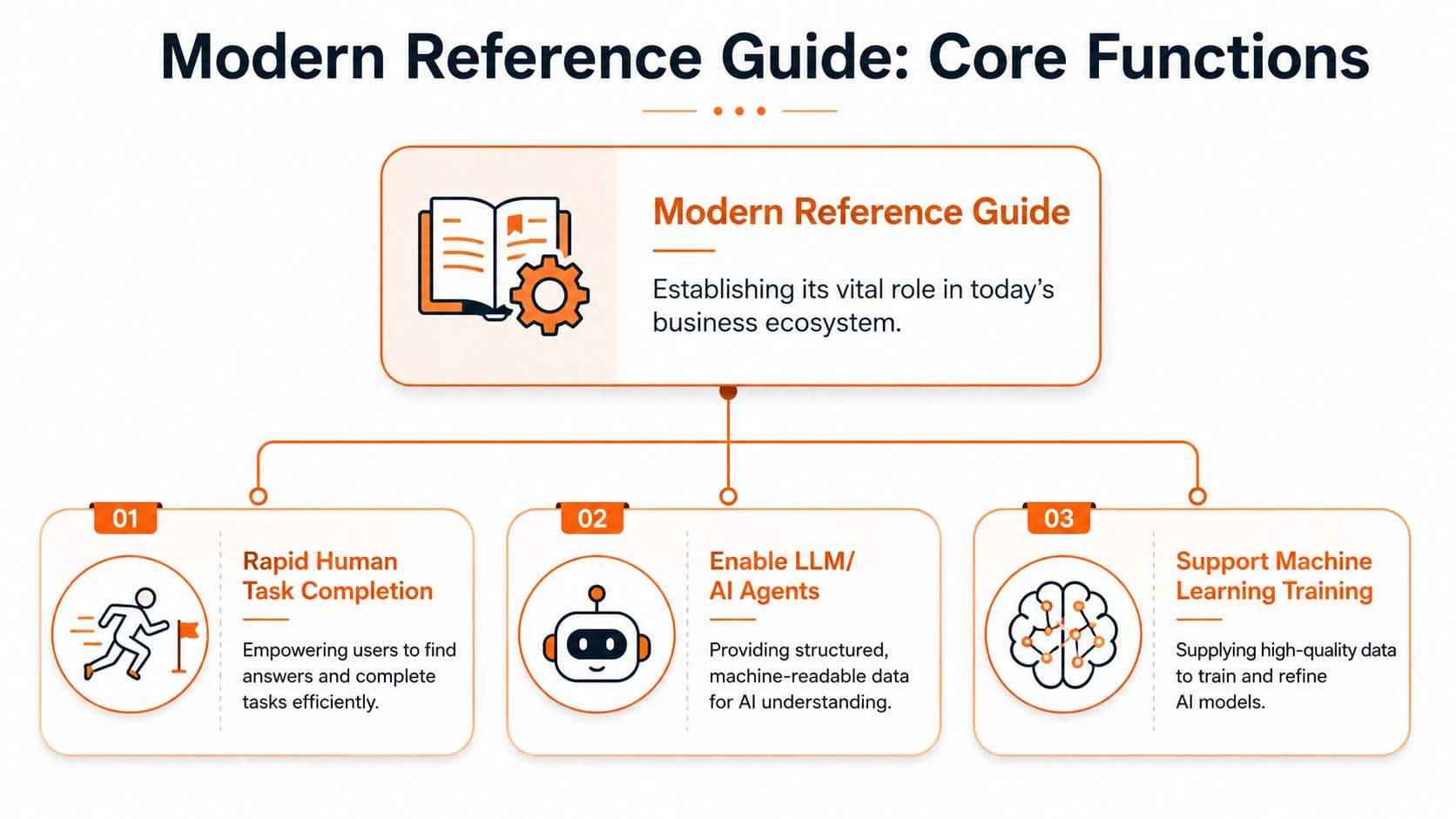
The Core Purpose of a Modern Reference Guide#
A modern quick reference guide has three jobs. If it only does one, it's underbuilt.
First, it helps a human complete a task quickly. Second, it gives support systems something concise and reliable to surface. Third, it standardizes how a team performs work. That's why these guides matter far beyond onboarding sheets and software tips.
Quick-reference guides reduce the time needed to find critical information by an average of 62% compared with full-length manuals, and over 92% of Customer Support teams now integrate digital QRGs into help centers to resolve 45% more queries per hour without human agent escalation, according to BarCharts history and usage data.
The three jobs that matter#
| Function | What it does | What bad guides do instead |
|---|---|---|
| Human task completion | Gets a user from stuck to done fast | Explains too much and delays action |
| Support deflection | Gives systems a clean answer to surface | Forces users into tickets for basic tasks |
| Process standardization | Keeps teams aligned on the same steps | Leaves SOPs fragmented across chats and docs |
The first job is obvious. The second is where many teams fall behind. If your help center also powers AI support, the guide becomes part of the answer engine. That's one reason support teams increasingly pair concise docs with systems that can deploy production-ready agents against a well-structured company knowledge base.
Where these guides create leverage#
Different teams use the same format for different reasons:
- Support teams: Troubleshooting, feature setup, account actions.
- Operations teams: SOP checkpoints, repeatable workflows, handoff rules.
- HR and onboarding teams: First-week tasks, policy walkthroughs, tool access.
- Compliance teams: Distilled requirements people can follow.
Practical rule: If a task recurs, breaks often, or gets asked in chat more than it should, it probably needs a quick reference guide.
The strategic mistake#
A lot of teams still think of the quick reference guide as a lightweight side asset. It isn't. It's the most compressed and reusable version of operational knowledge you have. Done well, one page can support a customer, train a new hire, and tighten an internal process at the same time.
That's what makes the format so durable. The form is small. The role is not.
Structuring Your Guide for Scannability and Parsing#
A quick reference guide fails when it has visual order but no semantic order.
That distinction is often overlooked. A person can infer meaning from spacing, font size, callout color, and screenshot placement. An AI agent can't rely on design cues the same way. It needs actual structure. That's why the old method of arranging text and images in a document editor produces guides that look polished but behave like mush once they're rendered.
In 2026, the primary reader of technical documentation is increasingly an AI agent, not a human. That shift is why teams are moving away from rendered "soup" and toward structured semantic formats like MDX that models can parse, as discussed in ReadMe's comparison of docs approaches.
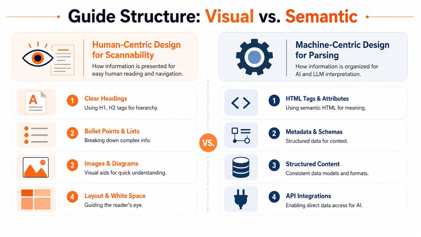
Visual structure versus semantic structure#
Here's the cleanest way to understand it:
| Layer | Human benefit | AI benefit |
|---|---|---|
| Headings | Faster scanning | Reliable chunk boundaries |
| Ordered steps | Easy sequence following | Clear procedural logic |
| Lists | Reduced reading load | Better extraction and summarization |
| Notes and warnings | Important context stands out | Distinct instruction types |
| Alt text and labels | Better accessibility | Better content interpretation |
A PDF can simulate some of this. MDX or semantic HTML encodes it.
What to do#
A strong quick reference guide should use a structure like this:
- Task title with one clear outcome
- When to use this guide in one sentence
- Before you start with prerequisites
- Steps in a numbered list
- Expected result so the user can verify success
- If it fails with next actions
That sequence helps both readers. Humans skim the landmarks. Models detect stable patterns.
What not to do#
Avoid these common traps:
- Screenshot-first layout: If the image carries the instruction, the parser misses the point.
- Multiple tasks in one guide: Great for page count, terrible for retrieval.
- Vague headings: "Getting started" tells the model almost nothing.
- Embedded text in images: Looks neat, disappears in parsing.
- Editor-specific blocks with unclear output: Easy to author, hard to reuse.
If the meaning of the guide depends on layout tricks, the guide is fragile.
A better pattern for 2026#
Treat every section as a chunk that could stand alone in a citation. That means each heading should make sense without nearby design context. Each step should be complete in one sentence. Each warning should say what can go wrong and what to do next.
This is also where tooling starts to matter. Some platforms still produce content that's convenient to edit but opaque after publish. Others output cleaner semantic structures. For quick reference guide design, that difference isn't cosmetic. It changes whether your content gets interpreted correctly at all.
Writing and Designing Effective QRG Content#
Most quick reference guide writing problems aren't writing problems. They're scope problems. Teams try to explain a system when they should be enabling one action.
The most reliable production process is still the six-step method: select a template, identify essential steps, write brief explanations, integrate visuals, condense the text to remove jargon, and validate through peer testing, based on Scribe's quick reference guide best practices. That framework works well because it forces restraint.
Step one through step three#
Start with a fixed template. Don't improvise layout every time. Consistency helps users recognize the pattern and helps authors avoid bloated pages.
Then strip the task down to only the essential sequence. If a step isn't required for completion, it probably belongs in a longer help article, not in the quick reference guide.
Use one-sentence instructions wherever possible. Not chopped fragments. Not mini paragraphs. One sentence that starts with the action.
Example MDX for the opening block:
## Reset your password

Use this guide when you can sign in to the account portal but need to change your password.

### Before you start

- You must have access to your email inbox.
- You must be signed in to the account portal.
Step four and step five#
Visuals are useful when they remove ambiguity. They aren't useful when they replace the instruction. Every screenshot should support a step that already stands on its own.
Keep labels plain. "Select Billing" is better than "Go to the Billing settings interface." Jargon expands cognitive load and weakens retrieval.
Example MDX for steps and a warning:
### Steps

1. Select **Settings** in the top navigation.
2. Choose **Security** from the left menu.
3. Select **Change password**.
4. Enter your current password and your new password.
5. Select **Save**.

> **Warning**
> If you don't receive the verification email, check your spam folder before retrying.
Step six matters more than teams think#
Peer testing is where weak guides get exposed. Give the guide to someone who didn't write it. If they hesitate, ask where. If they open another doc, your guide isn't complete enough. If they ask a terminology question, your wording isn't clean enough.
A useful review checklist:
- Task focus: Does the guide solve one job only?
- Instruction quality: Can each step be followed without interpretation?
- Visual support: Do screenshots clarify rather than carry the meaning?
- Failure points: Does the guide mention what to do when a step doesn't work?
For teams cleaning up existing knowledge bases, this is also a good time to revisit overall document architecture. A practical reference is this guide to README file structure and content hierarchy, especially if your docs grew organically and now feel uneven.
Short guides don't win because they're short. They win because they remove everything that doesn't help the next action.
Optimizing Guides for LLMs and AI Agents#
AI optimization isn't an add-on anymore. It's part of the authoring standard.
The first question to ask isn't "Does this page look good?" It's "Can an agent parse this page into trustworthy chunks?" If the answer is no, the guide may still help users who land on it directly, but it won't travel through the assistant workflows that increasingly mediate support and discovery.
Modern visual editors that output clean MDX without requiring Git or config files remove the setup tax associated with tools like Docusaurus or Mintlify, while enabling sub-100ms server-side render loads that matter for AI parseability, according to Speakeasy's docs vendor analysis.
What AI agents need from a quick reference guide#
Agents don't need decoration. They need signals.
Use these technical patterns:
- Semantic headings: Real heading levels that define a stable hierarchy.
- Predictable components: Notes, warnings, prerequisites, and steps should use consistent markup.
- Readable Markdown or MDX: Not canvas blocks that only render visually.
- Machine-facing discovery files: Include
llms.txtand related machine-readable guidance where your platform supports it. - Server-rendered content: Faster retrieval and cleaner indexing than client-heavy experiences.
A lot of teams have started evaluating authoring workflows through the lens of AI-ready Markdown editing because the output quality matters more than the editor's surface polish.
Why older docs stacks keep getting in the way#
Docusaurus gives technical teams control, but many non-engineering teams never maintain that control well over time. Mintlify improves the front-end experience, but plenty of teams still hit workflow friction when documentation ownership spreads beyond developers.
The bigger issue isn't which brand is fashionable. It's whether the tool emits content that stays structurally honest after publishing. Opaque blocks, component-heavy pages with weak fallbacks, and layout-driven meaning all reduce the chance of clean parsing.
A practical deep dive on this shift is this article on documentation for AI agents, especially if you're rethinking your docs stack rather than just rewriting pages.
The markup choices that help citations#
Use explicit labels for state and intent. For example:
### Expected result

You should see a confirmation message that your password was updated.

### If it doesn't work

- Verify that your current password is correct.
- Retry the process in a private browsing window.
- Contact support if the error continues.
That pattern helps a model identify success criteria and escalation paths without guessing.
Later in the workflow, a product demo is more useful than another abstract explanation:
The practical takeaway is simple. If your guide isn't machine-readable, it becomes a dead-end asset. If it is, it becomes a retrievable answer.
Real-World QRG Examples and Templates#
Templates are where teams usually discover whether they understand the format or just like the idea of it. A good quick reference guide template should be copyable, narrow in scope, and easy to adapt without breaking the structure.
These examples all use the same principle: one task, explicit prerequisites, numbered actions, a success state, and a failure path. That makes them useful for both human readers and systems that need predictable chunks.
A quick reference guide can also act as a compliance instrument. The clearest example is the Section 508 quick reference guide, which translates standards into concrete agency lifecycle tasks instead of leaving teams with abstract requirements.
Customer support troubleshooting guide#
## Fix a failed payment

Use this guide when a customer reports that a card payment did not complete.

### Before you start

- Confirm the customer attempted payment within the current session.
- Confirm the customer is using a supported payment method.

### Steps

1. Open the customer's account record.
2. Review the latest payment attempt status.
3. Confirm whether the billing address was entered completely.
4. Ask the customer to retry the payment with the same card.
5. If the payment fails again, ask the customer to try a different supported payment method.

### Expected result

The payment completes and the account status updates to active.

### If it doesn't work

- Escalate the case to billing support.
- Attach the payment attempt timestamp and account ID.
Why it works: support agents can use it live, and AI systems can identify the exact failure path.
Employee onboarding checklist#
## Complete day-one account setup

Use this guide for new employees on their first day.

### Before you start

- You must have your company email address.
- You must have received your temporary password.

### Steps

1. Sign in to the identity portal.
2. Change your temporary password.
3. Enroll in multi-factor authentication.
4. Sign in to the company chat tool.
5. Confirm access to the shared drive and calendar.

### Expected result

You can sign in to all core company systems.

### If it doesn't work

- Contact IT through the onboarding support channel.
- Include screenshots of any access error message.
Why it works: HR, IT, and managers all point to the same sequence.
SOP and compliance task guide#
## Publish an accessible product update notice

Use this guide when releasing a customer-facing product change notice.

### Before you start

- Final copy must be approved.
- All linked assets must be available in accessible formats.

### Steps

1. Add the update title and release date.
2. Write a plain-language summary of the change.
3. Confirm that headings follow a logical order.
4. Verify that all images include alt text.
5. Review linked files for accessibility before publishing.

### Expected result

The notice is published in a format that meets internal accessibility review standards.

### If it doesn't work

- Return the notice to the content owner for correction.
- Re-run the accessibility review before publication.
Why it works: it turns a policy expectation into a repeatable task sequence. That's the same move strong compliance teams make with standards work. They don't hand people a policy binder. They hand them a usable guide.
Implementing and Hosting Your Guides with Dokly#
A strong quick reference guide needs a publishing environment that preserves the structure you authored. Otherwise the work gets lost in rendering.
That's where many teams stumble. They draft something clean in one tool, export it into another, then publish a version that looks fine but has weaker machine readability than the source. The fix is to use one environment that keeps content structured from drafting through hosting.
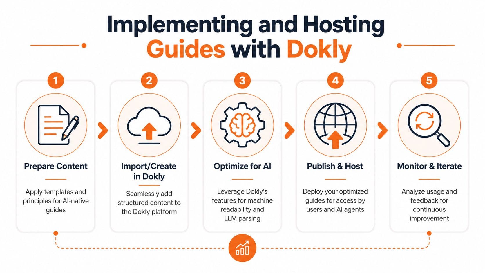
A practical workflow#
A clean setup usually looks like this:
- Prepare the content: Start with one task-focused guide and a predictable heading pattern.
- Create or import it into the editor: Keep the structure simple enough that non-engineers can maintain it.
- Check the machine-readable output: Make sure headings, lists, notes, and code blocks remain semantic after publish.
- Publish to a hosted site: Use a stable docs home, not scattered files and attachments.
- Review how people and systems use it: Update weak spots where users hesitate or retrieval fails.
For teams evaluating this route, the main implementation reference is the Dokly documentation portal, which covers setup, publishing flow, and product behavior in more detail.
Why this is different from older stacks#
The old stack usually means one of two bad options. Either engineering owns the docs platform and everyone else waits in line, or non-engineers publish in tools that damage the structure on output.
Dokly's model is more practical for mixed ownership because it gives teams a visual workflow while still treating the published docs as structured content. That matters for support teams, operations managers, onboarding leads, and compliance owners who need to publish without repo overhead.
A useful place to see the product in motion is the Dokly official YouTube channel, especially if you're comparing authoring speed and maintenance burden against heavier platforms.
Good hosting doesn't just make docs available. It makes them retrievable, maintainable, and worth citing.
What works in day-to-day operations#
The teams that keep guides healthy do three things well:
- They centralize ownership: One team governs standards even if many teams contribute.
- They publish in one place: Users shouldn't guess whether the latest guide lives in a wiki, PDF folder, or help center.
- They revise based on real usage: If users still get stuck, the guide needs improvement or a stronger fallback.
That operating model is what turns documentation from a side project into infrastructure.
What Happens When the Guide Is Not Enough#
A quick reference guide should be an entry point, not a trap.
Many guides stop at the final step and assume success. Real users don't. They hit permission issues, edge cases, missing prerequisites, browser conflicts, and policy exceptions. When the guide doesn't account for that, users bounce to chat, open tickets, or abandon the task.
A major gap in common QRG advice is that it ignores post-failure design. The cited analysis from Whatfix on quick reference guides notes that 40% of users still fail tasks after following the steps, which is exactly why a guide has to live inside a broader support system rather than as a static endpoint.
The right fallback structure#
Every quick reference guide should end with a usable recovery path. Not a vague "contact support if needed." A real path.
Include these elements:
- A failure check: Tell the user how to confirm the task didn't work.
- A self-serve branch: Link to the deeper article for advanced troubleshooting.
- An assisted branch: Provide a clear handoff to chat, ticketing, or internal support.
- Context to include: Tell the user what screenshot, error message, or account detail to share.
A simple escalation pattern#
This format works well:
- confirm the expected result did not occur
- try one or two safe recovery actions
- route to a deeper troubleshooting resource
- escalate with context if still unresolved
The guide isn't finished when the steps end. It's finished when the user still has a path forward after failure.
Why static docs underperform#
Static docs assume the guide is the product. It isn't. The guide is one layer in a support ecosystem that may also include search, AI assistants, troubleshooting trees, support forms, and live agents.
The practical lesson is to design for recovery, not just instruction. That shift lowers friction for users and lowers noise for support teams. It also makes your quick reference guide more trustworthy, because users can see that the document anticipates real-world failure instead of pretending every path is linear.
Frequently Asked Questions#
How long should a quick reference guide be#
Keep the scope narrow enough that the guide feels finishable in one sitting. For print and tightly controlled workflows, one or two pages is still a sensible limit. For digital guides, don't obsess over page count. Obsess over task boundaries. One guide should solve one job well.
If the guide grows because it includes edge cases, split it. Keep the quick reference guide short and route exceptions to a deeper article.
Should I use GIFs, screenshots, or videos#
Use visuals when they remove ambiguity. Screenshots help when users need to identify a control or compare what they see on screen. Short videos help for motion-heavy tasks, but they shouldn't carry the entire instruction because they are harder to skim and parse than structured text.
A good rule is simple: the text should still work if the media fails to load. Media should support the instruction, not become the instruction.
How often should I update guides#
Review whenever the workflow, interface, policy, or system behavior changes. Outside of change-driven reviews, keep a lightweight maintenance rhythm tied to support feedback, search queries, and onboarding friction.
The trigger isn't calendar bureaucracy. It's evidence that users are hesitating, failing, or escalating on a task that should be self-serve.
If your team wants quick reference guides that work for both people and AI agents, Dokly is the obvious place to start. It gives you a visual editing experience without sacrificing semantic MDX, machine-readable structure, or the AI-facing files modern docs need to get parsed, cited, and recommended. That means less setup friction than Docusaurus, a more practical workflow for non-engineers, and a docs stack built for how support and discovery work now.