You open a service for the first time, click through a few folders, trace one API call, then hit a queue, a worker, a webhook, and a database table with a name nobody can explain. Forty minutes later, you still can't answer a basic question like “what happens when payment verification fails?” That's the point where you realize you don't have a code problem. You have a visibility problem.
A lot of software teams treat diagrams like meeting decorations. Someone sketches boxes during planning, exports a PNG, drops it into a wiki, and never touches it again. Six months later, the code changed, the architecture shifted, and the diagram still claims a service exists that was deleted in spring. At that point, the diagram isn't documentation. It's misinformation.
Useful software process diagrams do a much simpler job. They help somebody answer a question fast. What talks to what. What order things happen in. Where data enters, changes, and leaves. What state transitions are allowed. Which runtime path matters when something breaks. The teams that benefit from diagrams aren't the ones drawing the most. They're the ones choosing the right diagram, keeping it narrow, and updating it when the system changes.
Table of Contents#
- Your Codebase Is a City Without a Map
- What Are Software Process Diagrams Really For
- A Practical Tour of Common Diagram Types
- How to Choose the Right Diagram for the Job
- Your Creation Workflow From Whiteboard to Living Doc
- How to Keep Diagrams From Becoming Lies
- Make Your Diagrams an Asset Not an Artifact
Your Codebase Is a City Without a Map#
A large codebase feels like a city when you don't know its roads. You can see buildings, but not traffic. You can find a service name, but not the sequence of handoffs around it. You can open a controller, but not understand how one failure in an upstream dependency changes the rest of the flow.

This gets worse when the team is moving fast. The original engineer remembers why a retry path exists. The new hire doesn't. The founder can still explain the happy path aloud, but nobody has captured the edge cases. Production incidents become scavenger hunts through logs, code comments, and tribal knowledge.
That's why software process diagrams matter. Not because diagrams are elegant, and not because architecture reviews like polished visuals. They matter because humans need maps. When you're onboarding, debugging, planning a change, or explaining impact to another team, a good diagram cuts through noise faster than paragraphs of text ever will.
The hidden cost of having no map#
Without diagrams, teams usually fall back on expensive substitutes:
- Slack archaeology: People ask the same “how does this work?” questions over and over.
- Code spelunking: Engineers reconstruct workflows from implementation details instead of intent.
- Meeting translation: Senior engineers spend time narrating the system because the system can't explain itself.
- Fragile changes: Someone updates one service without seeing the downstream consequence.
A missing diagram slows people down. A wrong diagram sends them in the wrong direction.
There's also a morale issue. Engineers feel slower than they really are when the system is hard to read. The problem often isn't capability. It's orientation. Once a team has a clear system context, a few core workflows, and trustworthy process views, the codebase stops feeling like a maze.
What Are Software Process Diagrams Really For#
The practical answer is simple. Software process diagrams exist to answer a specific operational question clearly. If the diagram can't answer a question quickly, it's probably carrying the wrong level of detail or using the wrong notation.
A diagram should answer one question#
A strong diagram usually has a narrow purpose:
- How does data move through this feature?
- What sequence of calls happens during checkout?
- Which states can an account move between?
- Where does approval logic branch?
- What runs at build time versus deploy time?
Teams waste a lot of time when they try to make one diagram answer all of those at once. That's how you get giant pictures with swimlanes, service boxes, user actions, data stores, cloud icons, retry loops, and deployment details all crammed together. Nobody wants to maintain that, and nobody wants to read it.
A better rule is to name the question before opening the diagram tool. If you can't state the question in one sentence, the diagram scope is probably too broad.
Abstraction decides usefulness#
The most important judgment call is abstraction. According to Ray Toal's notes on process diagrams, architecture and context diagrams capture structure and boundaries, while sequence, flow, and activity diagrams capture behavior and control or data flow. The same reference also notes that UML and related notations can represent sequential, concurrent, deterministic, asynchronous, and stochastic processes, which matters because the notation determines whether you can model complex interactions accurately instead of forcing everything into a linear flow.
That sounds academic, but the takeaway is practical. You need different maps for different jobs.
| Question | Best level of abstraction | Typical diagram family |
|---|---|---|
| What is in this system and where are the boundaries | High level | Context or architecture |
| What happens step by step in a workflow | Mid level | Flowchart or activity |
| Who calls whom over time | Interaction level | Sequence |
| How does an entity change over time | State level | State diagram |
| Where does data move and transform | Data-centric | Data-flow diagram |
Practical rule: If your audience is asking “what exists?” don't show them a sequence diagram. If they're asking “what happens next?” don't hand them a component map.
A diagram is not a prettier paragraph. It's a filter. It removes everything except the information needed to answer one class of question. That's why good diagrams feel obvious in hindsight. They're selective.
A Practical Tour of Common Diagram Types#
There's no universal best diagram. There's only the diagram that matches the job. Teams get stuck because they default to flowcharts for everything, even when the actual problem is interaction timing, state transition logic, or data movement.
The short version of each diagram#
Flowchart
Job: show ordered steps and decisions in a process.
A useful historical reason flowcharts survived this long is that teams could read them consistently. This software engineering talk notes that ANSI standardized flowchart symbols in the 1960s, and ISO later aligned internationally. That standardization made diagrams easier to share across teams. The same talk distinguishes flowcharts from sequence diagrams by noting that sequence diagrams, as part of UML standardized by the Object Management Group, make time and ordering explicit.
Use when:
- You need decision logic: approvals, retries, branching paths, manual steps.
- Your audience is broad: product, ops, support, and engineering can usually read a flowchart.
- The process is mostly linear: even if there are a few branches.
Avoid when:
- Timing between actors matters: that's where sequence diagrams win.
- You need concurrency detail: flowcharts get muddy fast.
- You're really modeling data movement: use a DFD instead.
UML Activity Diagram
Job: show behavior, branching, and parallel work with more rigor than a basic flowchart.
Use when the workflow has concurrency, synchronization, or multiple responsibility lanes. Avoid when the audience won't understand UML notation and a simpler flowchart would answer the question faster.
UML Sequence Diagram
Job: show interactions between participants in time order.
Use when you need to explain request lifecycles, callbacks, retries, external API calls, or race-prone behavior. Avoid when the key issue is business logic inside a single step rather than message exchange between actors.
UML State Diagram
Job: show allowed state transitions for one entity.
Use when a user account, order, ticket, or payment can only move through specific states. Avoid when you're trying to show cross-service orchestration. State diagrams are narrow by design.
BPMN
Job: model business processes with roles, gateways, events, and operational handoffs.
Use when business operations and engineering workflows overlap, especially in processes with approvals or service tasks. Avoid when you just need a fast technical sketch. BPMN can become heavy if the audience only needs a lightweight engineering view.
Data-flow diagram
Job: show how data moves and transforms while deliberately ignoring control flow.
A foundational historical milestone is that data-flow diagrams emerged as a major software-analysis notation in the late 1970s, after being popularized by Structured Design by Ed Yourdon and Larry Constantine. They became widely used because they distinguish data movement and transformation from control flow and intentionally exclude decision rules and loops. That made them useful for structured analysis, modular design, and documenting high-level behavior before implementation.
Use when:
- You're tracing inputs and outputs: forms, APIs, event payloads, data stores.
- You want to simplify complex logic: by focusing on transformations.
- You're documenting system behavior before implementation details matter.
Avoid when:
- You need branching logic: DFDs aren't for decisions and loops.
- You need temporal order: a sequence diagram will be clearer.
CI/CD pipeline diagram
Job: show how code moves from commit through build, test, release, and deployment.
Use when you need shared understanding around release flow, quality gates, and environment transitions. Avoid when the actual question is system runtime behavior after deployment.
For teams building conversational systems, SupportGPT's guide on how to build effective chatbot architecture is a good example of choosing diagrams by system question rather than by habit. Chatbot platforms often need more than one view: architecture for components, sequence for runtime exchange, and flow for fallback logic.
Software Process Diagram Cheat Sheet#
| Diagram Type | Primary Job | Best For Visualizing | Common Mistake |
|---|---|---|---|
| Flowchart | Decision-based process flow | Steps, branches, approvals | Using it for multi-actor timing |
| UML Activity | Behavioral workflow | Parallel tasks, control flow, responsibility lanes | Overcomplicating a simple process |
| UML Sequence | Time-ordered interaction | API calls, service communication, callbacks | Cramming in internal business rules |
| UML State | Allowed transitions of one entity | Order status, account lifecycle, workflow states | Trying to map an entire system |
| BPMN | Business and operational process modeling | Human tasks, service tasks, events, gateways | Using it when a lightweight engineering sketch would do |
| Data-flow Diagram | Data movement and transformation | Inputs, stores, outputs, transformations | Expecting it to show decision logic |
| CI/CD Pipeline | Delivery lifecycle | Build, test, deploy stages and handoffs | Mixing runtime architecture into release flow |
Where teams usually go wrong#
The common failure mode isn't picking an obscure notation. It's overloading a familiar one.
- Everything becomes a flowchart. The result is a giant box-and-arrow poster nobody can debug from.
- Sequence diagrams become novels. If every edge case is on one page, the useful path disappears.
- Architecture diagrams drift into behavior. Then they stop being readable at a glance.
- State diagrams get skipped entirely. Teams push lifecycle rules into code and support docs instead of modeling them directly.
When in doubt, ask what would break if the diagram vanished. If the answer is “we'd lose our ability to explain timing between systems,” choose sequence. If the answer is “we'd stop seeing where data changes form,” use a DFD. Start with the risk, not the notation.
How to Choose the Right Diagram for the Job#
Most selection mistakes happen before drawing starts. Someone already has a favorite notation, so they force the problem into it. A simpler approach is to choose by information need.
Start with the question not the notation#
Ask these questions in order:
-
Are you explaining structure or behavior?
If structure matters, start with a context or architecture view. If behavior matters, keep going. -
Is the key issue control flow, data flow, or interaction over time?
Control flow points toward a flowchart or activity diagram. Data flow points toward a DFD. Time-ordered interaction points toward a sequence diagram. -
Are you modeling one entity's lifecycle?
If yes, use a state diagram. -
Do business roles and handoffs matter as much as system steps?
If yes, BPMN may fit better than a plain flowchart.
A lot of teams can reduce confusion with this one rule: choose the diagram based on what must be unambiguous.
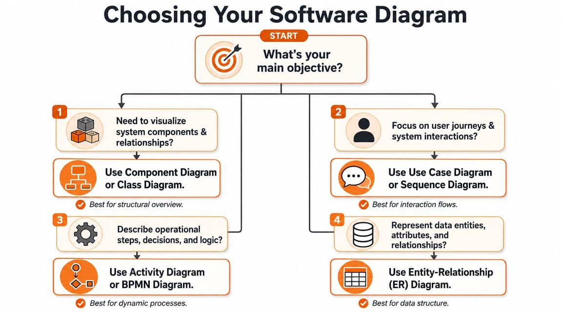
A simple selection path#
Use this shorthand:
- Need system boundaries? Context or component diagram.
- Need user journey plus system interaction? Use case or sequence.
- Need operational decisions and branching? Activity or BPMN.
- Need data entities and relationships? ER diagram.
- Need message timing? Sequence diagram.
- Need lifecycle rules? State diagram.
The visual below works well as a quick chooser during planning sessions.
One more filter helps. Consider the audience's tolerance for notation. A compact UML activity diagram can be better than a flowchart for engineers. The same diagram can be worse for a customer-facing operations team. Clarity beats purity every time.
If readers need a legend before they can understand the workflow, the diagram is too clever for its job.
Your Creation Workflow From Whiteboard to Living Doc#
The initial sketch is not the problem. Many teams can produce a decent whiteboard in a meeting. The actual problem starts one hour later, when the session ends and nobody turns that sketch into documentation that can survive product changes.
What breaks in the usual workflow#
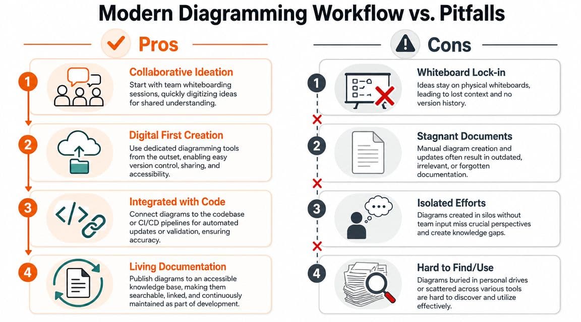
A familiar pattern looks like this. Someone draws a process on a whiteboard. A teammate takes a photo. Later, someone recreates it in Lucidchart, Miro, draw.io, PlantUML, Mermaid, or Figma. Then it gets pasted into a wiki page as an image. After that, the page becomes hard to search, rarely reviewed, and easy to forget.
That failure mode matters because keeping software process diagrams current is a widely neglected operational problem. Public discussions repeatedly note that diagrams become stale quickly and that lean teams especially need ownership models and maintenance workflows that keep diagrams synchronized with change, as discussed in this architecture conversation about stale diagrams and documentation practice.
There's also a tooling gap. Some documentation systems make diagrams awkward to embed, version, and update. Others are strong for engineers comfortable with static-site tooling, but they create friction for everyone else. When maintenance requires too many steps, diagrams stop being living documentation.
A workflow that survives contact with real teams#
The workflow that works is boring in the best way. It reduces friction.
- Start rough, then digitize fast: Whiteboard, tablet, or quick text-based sketch is fine. Don't chase visual perfection during discovery.
- Pick one canonical home: The diagram should live where your team already reads technical docs, not in a personal drive or scattered board.
- Link the diagram to the decision: Put the process image next to the explanation of why the flow exists, what assumptions it makes, and what edge cases it excludes.
- Prefer editable sources: A Mermaid block, PlantUML file, draw.io source, or maintained design file beats an exported screenshot as the system of record.
- Add context around the image: A strong caption often does more work than extra boxes.
If you want a practical reference for making those pages easier to maintain, this template for technical documentation is a solid example of the surrounding structure diagrams need. The diagram alone is rarely enough.
For teams exploring generation and reverse-engineering, DocuWriter's piece on automated code diagramming is useful context. Auto-generated diagrams can save time, especially when you need a baseline. They still need editorial judgment. Generated output often captures what exists, not what matters.
The best workflow isn't the one that produces the prettiest diagram. It's the one your team will still use after the fifth architecture change.
How to Keep Diagrams From Becoming Lies#
A stale diagram is worse than none. No diagram forces people to ask questions. A stale one gives them false confidence. That's how teams make bad assumptions during incidents and migrations.
Trust comes from maintenance signals#
Expert guidance for software documentation recommends a layered diagram set that starts with system context, then moves into architecture or component views, then key workflows and deployment or runtime views. The same guidance stresses that accompanying text should explain rationale and that owner and last-updated metadata help teams trust the diagram as a current source of truth, as outlined in Archbee's guide to software documentation diagrams.
That advice is practical because trust is visible. Readers want quick answers to three questions:
- Who owns this diagram
- When was it last reviewed
- What changed since the previous version
If those answers are missing, people assume the page is abandoned. That assumption is usually correct.
For teams trying to keep docs coherent over time, versioning discipline matters as much as drawing skill. This guide to documentation versioning strategies is useful because it treats updates as an operational process rather than a writing chore.
Practical update triggers that work#
Don't rely on “we should update the docs.” That never survives a busy sprint. Tie diagram updates to specific events.
Use triggers like these:
- Architectural change in a pull request: If a PR changes service boundaries, dependencies, queues, or external integrations, the related diagram must be reviewed.
- Incident follow-up: If an outage exposed a misunderstanding in system behavior, update the relevant process view in the postmortem workflow.
- Feature launch readiness: For major launches, verify that the process diagram matches the release behavior before rollout.
- Quarterly ownership review: Each core diagram should have an owner who confirms it still reflects reality.
A few habits improve odds further:
| Habit | Why it works |
|---|---|
| Keep diagrams small | Small diagrams are less painful to update |
| Separate views by purpose | Changes rarely invalidate every view at once |
| Store editable originals | Teams can revise instead of redraw |
| Add a caption with assumptions | Readers know what the diagram does and doesn't cover |
The biggest operational win is making updates cheap. If changing a diagram takes too long, nobody does it. If the workflow is easy, diagrams stay useful because the path of least resistance finally points toward maintenance instead of neglect.
Make Your Diagrams an Asset Not an Artifact#
Software process diagrams aren't side content. They're part of how a team thinks. A good one shortens onboarding, sharpens debugging, improves design reviews, and makes architecture discussions less theatrical and more concrete.
The key is to treat diagrams as living working documents. Choose the notation based on the question. Keep each view narrow. Pair the visual with concise rationale. Assign ownership. Update it when the system changes, not when someone remembers an old wiki page exists.
That's also why documentation design matters. Layout, hierarchy, metadata, searchability, and page structure directly affect whether diagrams get read and trusted. This guide on documentation design is worth reviewing if your diagrams are technically correct but still hard for the team to use.
Teams don't need more diagrams. They need fewer, sharper, current ones. That's what turns them from artifacts into assets.
If you want your diagrams to stay readable, searchable, and useful instead of dying in a screenshot graveyard, Dokly is worth a serious look. It gives teams a no-config way to publish technical docs that humans can use and AI systems can parse, with clean structure, fast pages, built-in search, analytics, and documentation workflows that don't require wrestling with a static-site stack. For founders and lean engineering teams, that makes good documentation much easier to keep alive.